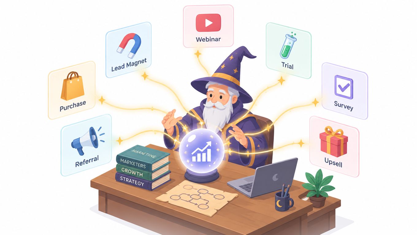
Most visitors who submit a form or finish checkout never hear another word from the brand, which makes the thank-you page a sorcerer's tower of second chances. The page can confirm what happened, remove uncertainty, deliver the promised resource, and guide the visitor toward one relevant next step without turning gratitude into a sales ambush.
This collection draws one transferable pattern from seven published guides across purchase, lead magnet, webinar, trial, and survey flows. Each example is annotated with its goal, effective copy, CTA, tracking placement, A/B test idea, and a Web Mage rewrite prompt. The mechanics matter more than the screenshots. A thank-you page is a measurable post-conversion experience, not merely a success message, and it deserves the same care as the funnel that summoned it.
Table of Contents
- 1. Leadpages
- 2. Unbounce
- 3. OptinMonster
- 4. Shopify Blog
- 5. GetResponse
- 6. Kit
- 7. Apexure
- Thank You Page Examples: 7-Platform Comparison
- Carry the Spellbook Home and Start Casting
1. Leadpages
The strongest pattern in Leadpages' thank-you page guide is scenario matching. Its examples span lead magnets, events, webinars, coupons, and purchases, then connect each situation to a sensible next action. That's more useful than copying a visually polished page whose context doesn't match your funnel.
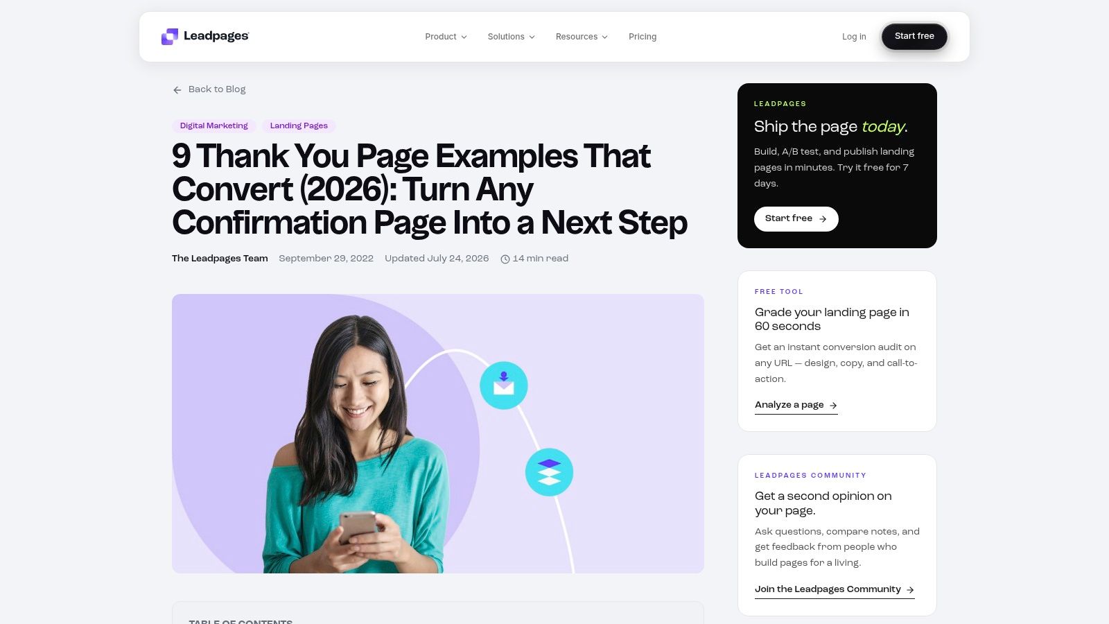
Goal: Move a newly converted visitor into the next logical stage. A webinar registrant might add the event to a calendar, while a lead-magnet subscriber might explore a small paid offer. The page should acknowledge the completed action before presenting that next spell.
Effective copy: “Your guide is on its way. While you wait, reserve your seat for the live walkthrough.” The first sentence confirms delivery expectations. The second introduces a related action without pretending the visitor has asked for something else.
CTA: “Add the walkthrough to my calendar” is stronger than “Continue.” Name the destination and the benefit.
Place the primary conversion event on the unique confirmation URL, then track the secondary CTA as a separate event. Segment results by funnel type, acquisition source, device, and offer. If the page includes a tripwire, monitor acceptance alongside refunds, support clicks, and repeat purchase behavior.
Practical rule: The next action should extend the visitor's intent, not interrupt it.
A/B test: Compare a calendar CTA against a related educational resource. Keep the confirmation copy and placement fixed, and judge the winner by downstream engagement, not clicks alone.
Web Mage rewrite prompt: “Rewrite this thank-you page for a webinar registrant. Confirm registration first, explain when access details arrive, add one calendar CTA, keep the tone magical but clear, and preserve all essential support information.”
For teams still mapping the complete journey, this guide pairs naturally with an explanation of what a funnel builder does.
2. Unbounce
Unbounce's thank-you page templates are most valuable when treated as CRO specimens rather than ready-made costumes. The gallery's vertical variety helps you compare how legal, travel, professional services, and other pages handle confirmation, social proof, follow-up questions, and secondary offers.
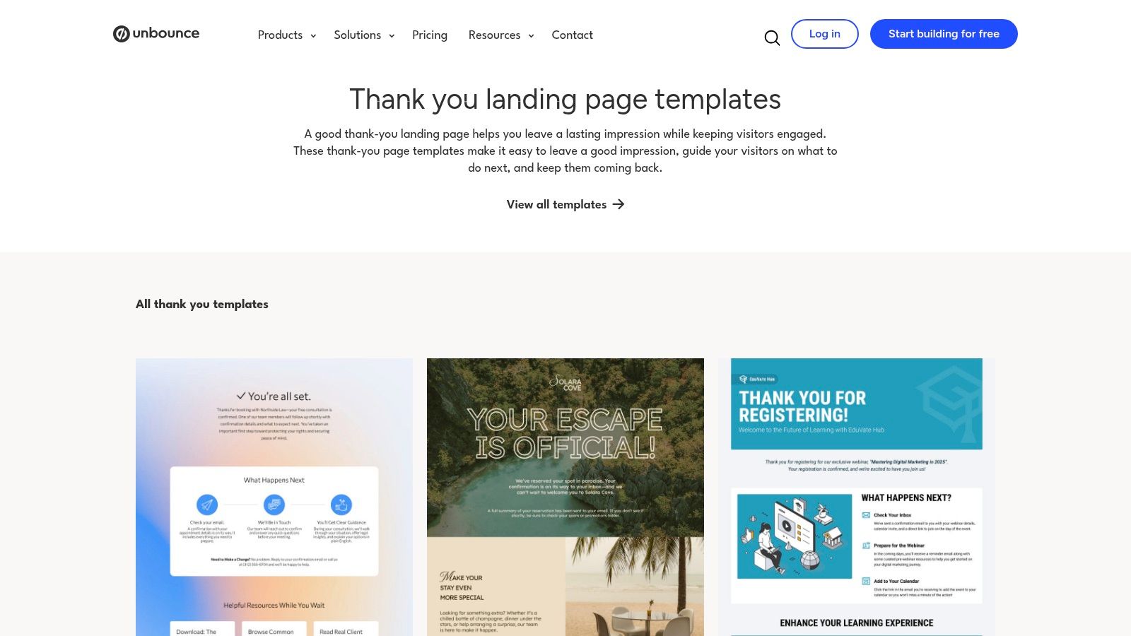
Take a lead-qualification pattern. After someone requests a consultation, the page can confirm the request and ask one useful question, such as the size of their team or the problem they want solved. That's progressive profiling with a purpose. It gathers context while the visitor is still engaged, but it shouldn't make the original submission feel incomplete.
Goal: Improve the quality of the next sales conversation without adding friction before conversion.
Effective copy: “Your consultation request is confirmed. What would you like to improve first?” This makes the question feel like preparation, not another form demanding proof of interest.
CTA: “Tell us what you need” works when the follow-up form is short. If the question is optional, label it clearly with “Answer in one minute” or similar plain language.
Track the confirmation page view, the second-form start, completion, and sales-qualified outcome. Keep the tracking events distinct. A visitor who opens the qualification form hasn't provided the same value as one who completes it.
A/B test: Compare an optional second question with a direct booking CTA. The booking route may create more immediate action, while the question may provide better context for sales. Define the success metric before launch.
The trade-off is access. Publishing many Unbounce templates requires a paid account, and previews may limit your ability to inspect every interaction. The pages also tend to reflect the platform's own ecosystem, so borrow the structure rather than copying the entire visual language.
Use Web Mage's AI-powered landing page builder when you want to turn the pattern into a connected, prompt-generated page instead of rebuilding the layout by hand.
3. OptinMonster
OptinMonster's anatomy of the perfect thank-you page gets the hierarchy right: confirmation, a clear CTA, and instructions for what happens next. Its examples range from opt-in follow-ups to purchase journeys, with recognizable brands such as Amazon, Salesforce, Wistia, and Crate & Barrel used to show how intent changes the appropriate action.
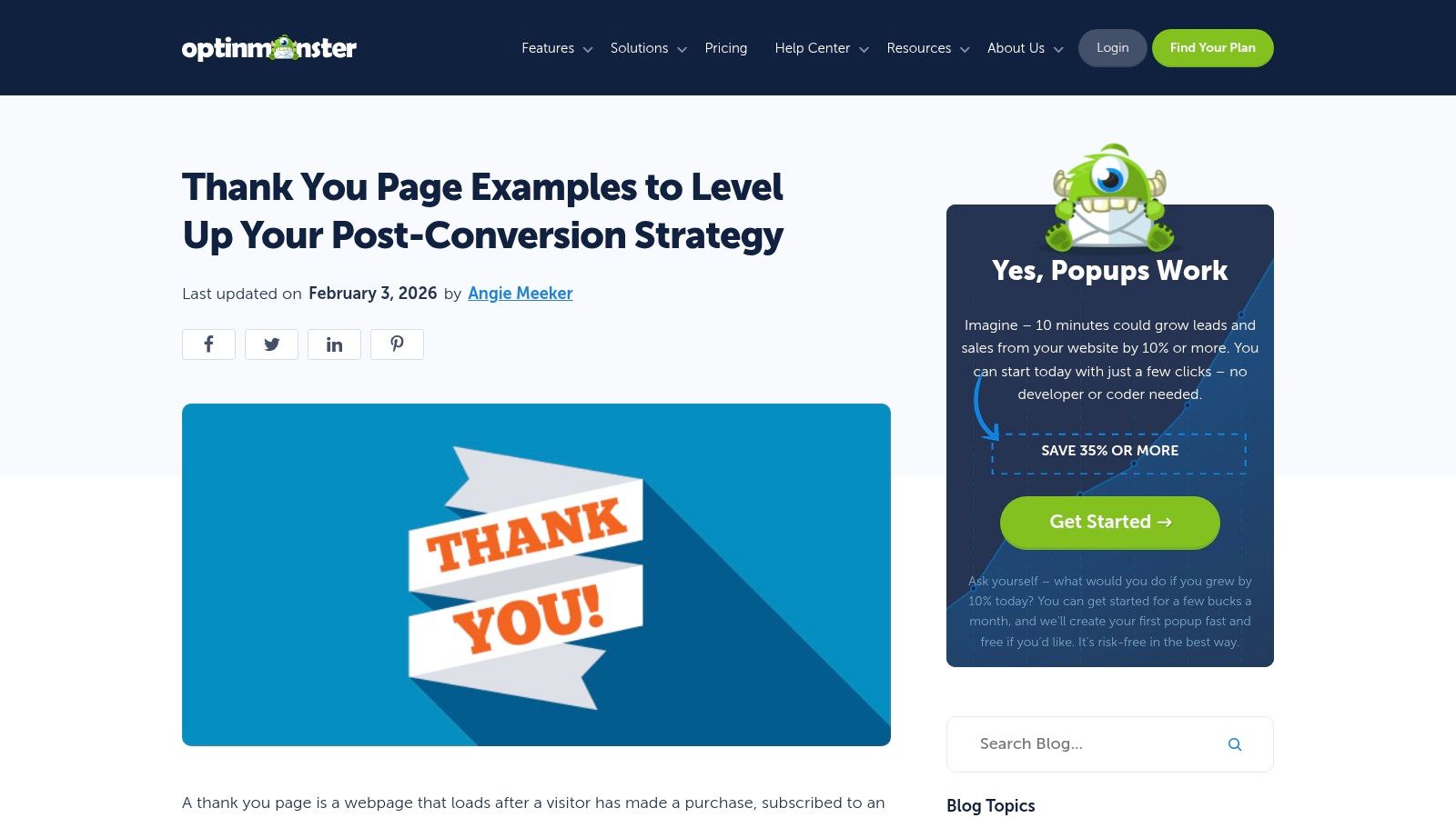
The most transferable example is the “second ask” pattern. A visitor who has just downloaded a resource might be invited to join a community, share the resource, or register for a related webinar. A customer who has purchased shouldn't see the same message. The page needs to read the intent correctly, like a mage choosing the right spell for the creature in front of them.
Goal: Keep momentum without burying the original confirmation.
Effective copy: “Your checklist is ready. If you want help applying it, join the founder workshop.” It connects the new CTA to the value the visitor already requested.
CTA: “Reserve my workshop seat” is specific. “Learn more” is often too weak unless the destination is genuinely exploratory.
For lead magnets, track the thank-you URL as the submission event, then measure the second CTA separately. For surveys, track starts, completions, and the answer path. If the page uses a popup success state rather than a full page, verify that analytics still records a reliable conversion event.
A/B test: Test a community invitation against a webinar invitation for the same lead source. Keep the headline fixed. The winning route should be judged by meaningful engagement and later conversion, not by the most immediate click.
The guide's limitation is its mixture of full pages and popup success views. Those are different product states. A popup can confirm an action inside the current context, while a dedicated page gives you more room for instructions, tracking, support, and segmentation.
For implementation, conversion optimization software can help teams treat each next step as an experiment instead of a permanent guess.
4. Shopify Blog
For ecommerce, the Shopify thank-you page guide offers a practical order-confirmation pattern: confirm the purchase, explain what happens next, then introduce a relevant upsell, cross-sell, social prompt, or user-generated-content request. The order summary must remain the primary spell. Revenue tactics come after certainty.
A thank-you page is the post-checkout confirmation stage where shoppers typically see the order number, purchased items, totals, and delivery details. Because the visitor has completed a conversion, the page reaches a known customer rather than an anonymous prospect. That makes it useful for support instructions, product education, surveys, referrals, and carefully framed add-on offers.
Goal: Reduce purchase anxiety while presenting one complementary follow-up action.
Effective copy: “Order confirmed. Your travel mug will ship with your selected delivery option. Add the matching filter pack to this order if you'd like a ready-to-use set.” The copy confirms the transaction before offering something that logically belongs with it.
CTA: “Add the filter pack” is clearer than “Shop now.” One action is easier to understand and easier to measure.
Track page-view rate, secondary-offer acceptance, support clicks, referral activity, survey completion, and repeat purchase behavior. Segment by product, traffic source, geography, and device. Keep the original receipt and delivery information above the fold, especially on mobile.
A documented 30-day funnel involving 18,420 views and 1,742 orders produced a 9.46% conversion rate for a five-offer upsell and downsell sequence, but that result describes one merchant and funnel design, not a universal benchmark. A separate analysis citing more than 40,000 Shopify merchants reported average thank-you-page upsell conversion of 1.7%, with leading implementations reaching approximately 6.8% to 8%. The same analysis reported 4.7% average conversion for one-click post-purchase upsells, while the top 5% reached 28.3%. These figures appear in Oxify's Shopify analysis, and they're best used as calibration, not promises.
A/B test: Compare a complementary add-on with no offer. Measure incremental gross profit per visitor, cancellations, refunds, and support contacts, not just acceptance.
5. GetResponse
GetResponse's thank-you page examples are useful when one business runs several funnel types. The guide moves through newsletters, webinars, gated content, purchases, creator offers, and B2B journeys, showing how a page can deliver the promised asset immediately while opening a carefully chosen path forward.
The most transferable pattern is immediate delivery plus a light invitation. If someone requests a report, give them access on the page and in the email. Don't force them to hunt through their inbox for value they've already earned. Then offer one related action, such as sharing the resource, joining a community, or exploring a low-commitment product.
Goal: Fulfill the promise quickly and reduce the gap between signup and useful engagement.
Effective copy: “Your report is ready to read. If the findings match your challenge, book a practical review with our team.” This sequence respects the visitor's original request before asking for more attention.
CTA: “Open the report” should be the primary CTA. A secondary “Book a review” can sit below it, but only if the two actions don't compete visually.
Track the resource-access click, confirmation URL view, secondary CTA click, and eventual booking or purchase. For referral prompts, also track share clicks, copied links, completed referred signups, and referred-customer revenue. A thank-you page can support retention, but only if the next action remains relevant.
The page should answer the visitor's immediate question before it asks a new one.
The guide's breadth is its strength, although some screenshots are older. Borrow the information architecture and copy logic, then refresh typography, spacing, accessibility, and mobile behavior for your own brand. A dated screenshot can still contain a sharp conversion pattern.
A/B test: Compare direct resource access with a resource-plus-video introduction. Keep the page's first action obvious and measure whether the added explanation improves meaningful follow-up or merely delays access.
6. Kit
Kit's thank-you page roundup suits creators, course sellers, coaches, and solo founders who need clarity more than a crowded sales machine. Its scenario-based examples cover contact forms, email signups, lead magnets, freebies, webinars, events, appointments, and donations, with each example tied to a practical tip.
The strongest pattern is brevity with a visible next step. A creator's confirmation page often needs to say only three things: the action succeeded, the promised item is available or on its way, and the visitor knows what to do next. That restraint can be more persuasive than an elaborate sales sequence.
Goal: Turn a new subscriber or registrant into an informed participant.
Effective copy: “You're registered for the workshop. Check your inbox for the access link, then reply with the question you most want answered.” It sets expectations and creates a simple feedback route without adding a second conversion funnel.
CTA: “Send my question” is appropriate if it opens a lightweight form or email action. For a course purchase, “Start lesson one” is more useful than an invitation to browse unrelated products.
Use event tracking for the page view, access click, community join, survey response, and any tripwire acceptance. For immediate post-checkout research, ask about acquisition source, checkout friction, purchase intent, or what nearly stopped the visitor. Save satisfaction, product quality, and repurchase questions for after delivery or product use. Userloop's post-purchase survey guidance recommends keeping the immediate survey focused, with one to three questions before attention moves elsewhere.
A/B test: Compare a one-question friction survey with a next-content CTA. Keep the survey optional and measure completion, support contacts, and later conversion.
The page shouldn't assume personalization automatically creates loyalty. A Wageningen University study found that adding a message to online orders didn't itself affect satisfaction or loyalty, while message type mattered, with a generic message producing more satisfaction than a personalized message in its results. The study supports using personalization for clarity and relevance, not decoration.
7. Apexure
Apexure's thank-you page examples take the most operational view of the group. The guide emphasizes unique thank-you URLs, conversion pixels, no-index guidance, analytics, and a single focused secondary CTA across contact, webinar, demo, lead-magnet, purchase, and course flows.
That doctrine is easy to underestimate. A beautiful page that can't distinguish a form submission from a casual visit is a dragon guarding an empty chest. The URL and event structure should make the conversion legible to your analytics system, while the page itself should make the visitor's next step legible to the visitor.
Goal: Create a confirmation state that both humans and measurement tools can understand.
Effective copy: “Your demo request is confirmed. We'll use the details you provided to prepare the right walkthrough. Choose a time that suits you.” The copy tells the visitor what happened and why the next action matters.
CTA: “Choose a demo time” is focused and operational. Avoid stacking calendar booking, newsletter signup, social links, and unrelated offers above it.
Place the unique confirmation URL after successful submission, fire the conversion pixel once, and mark the secondary CTA as a separate event. Exclude the page from search indexing when it contains private confirmation content or should not attract organic visits. Audit keyboard focus, labeled controls, readable status messages, form errors, modal dialogs, and mobile layout. Confirmation pages belong in accessibility audits, as Webability's audit guidance makes clear.
A/B test: Compare a single booking CTA with a booking CTA plus one optional question. Track booked meetings, qualified opportunities, completion rate, and support requests.
One caution: the guide includes agency promotion and some composite or mockup screenshots. Treat those visuals as pattern references. The durable lesson is the measurement architecture.
Thank You Page Examples: 7-Platform Comparison
| Resource | Implementation complexity | Resource requirements | Expected outcomes | Ideal use cases | Key advantages |
|---|---|---|---|---|---|
| Leadpages | Low–Medium, prescriptive examples ready to adapt | Minimal design/dev; uses Leadpages templates and screenshots | Fast mapping of post-conversion flows and “next action” logic | Marketers building funnels; B2B and ecommerce quick models | Up-to-date, practical examples across common use cases |
| Unbounce | Medium, CRO-focused adaptation and testing | Paid Unbounce account for full templates; CRO expertise helpful | Better copy/structure and measurable landing improvements | CRO teams optimizing landing pages and vertical templates | Strong CRO rationale and verticalized template gallery |
| OptinMonster | Low–Medium, tactical, annotation-driven implementation | Content/copy work; mix of popups and full-page assets; some tool promos | Clear confirmation + aligned CTAs; actionable CTA types by intent | Lead nurturing, upsell and feedback flows for marketers | Many annotated visuals and step-by-step UX/copy notes |
| Shopify Blog | Low, ecommerce-specific, checklist-driven changes | Shopify checkout/apps integration; merchant screenshots | Revenue-focused order confirmations (upsells, cross-sells, shares) | DTC stores and Shopify merchants optimizing order flow | Concrete merchant examples tied to Shopify capabilities |
| GetResponse | Medium, broad, example-heavy adaptation across scenarios | Content/template adaptation; occasional builder promotions | Wide-funnel coverage and many actionable post-conversion ideas | Diverse funnels: content creators, B2B, ecommerce teams | Extensive example set and practical ideas list |
| Kit (formerly ConvertKit) | Low, concise, creator-focused tips | Lightweight creator-focused assets; fewer enterprise examples | Clear, brief confirmation flows emphasizing “what's next” | Solo creators, course authors, webinar hosts | Clean editorial tone tailored to creators and solo founders |
| Apexure | Medium–High, analytics and measurement-first implementation | Measurement setup (pixels, unique URLs), design snippets, agency guidance | Measurement-ready thank-you pages and A/B testing defaults | Agencies, performance marketers, analytics-focused teams | Field-tested analytics best practices and measurement doctrine |
Carry the Spellbook Home and Start Casting
The best thank-you page examples don't all cast the same spell. Leadpages is strongest for mapping the next action to the conversion scenario. Unbounce brings a CRO lens to second asks and qualification. OptinMonster clarifies the hierarchy of confirmation, CTA, and instructions. Shopify is the practical choice for order flows and complementary offers. GetResponse broadens the field across content, webinars, and creator funnels. Kit keeps the experience concise for solo operators. Apexure supplies the tracking and accessibility discipline that many galleries leave in the shadows.
The shared principle is simple. Confirm the completed action first, then offer one relevant next step. A customer who has paid needs order certainty and support access. A webinar registrant needs event details and a calendar action. A lead who has downloaded a guide may be ready for a related workshop, but not necessarily for a hard sell. Immediate post-conversion research should ask about attribution or checkout friction, while product satisfaction belongs after delivery or use.
The lifecycle stakes reach beyond one page. A 2025 PwC customer-experience survey, reported in ClickPost's post-purchase retention coverage, found that 52% of consumers had stopped buying from a brand after a bad experience. The same reporting found that 90% of executives believed customers had become more loyal, while only 40% of customers agreed. Clear confirmation, realistic delivery expectations, and accessible support are therefore conversion work, not decorative courtesy.
Pick one thank-you page this week and give it a single focused secondary CTA, a unique confirmation URL, and clean conversion tracking, as the field-tested guides recommend. Then run one A/B test with a clear success metric. In Web Mage, one plain-language prompt can draft the variant, and the Conversion Alchemist can allocate traffic, track significance, and promote the winner, so your thank-you page keeps working its magic long after the form is sent.
Web Mage can generate connected funnels with landing, checkout, upsell, and dedicated thank-you pages from plain-language prompts, then support chat-based edits and built-in split testing. Visit Web Mage to turn one of these thank-you page patterns into a measurable funnel experience.