
A 0.1-second improvement in load time increased conversions by 8% for retail sites and 10% for travel sites on average, according to Google's Milliseconds Make Millions report. That's not a mystical rounding error. It's a reminder that conversion rate optimization often comes from small changes repeated with discipline, not from summoning an entirely new website at midnight.
The practical answer to how to optimize conversion rate is a loop: measure the right outcome, investigate the friction, form a falsifiable hypothesis, run a clean test, ship what works, and begin again. Think of each experiment as a spell. Some fizzle. Some summon a dragon. The craft lies in building a system that learns from both.
Table of Contents
- The Spellbinding Truth About Conversion Rate
- Benchmark Your Way to a Baseline Worth Trusting
- Scry the Funnel With Research Before You Test
- Turn Insights Into Testable Hypotheses
- Cast an A/B Test That Survives Peer Review
- Polish Speed and UX for the Quickest Wins
- Build the Daily Optimization Loop and FAQ
The Spellbinding Truth About Conversion Rate
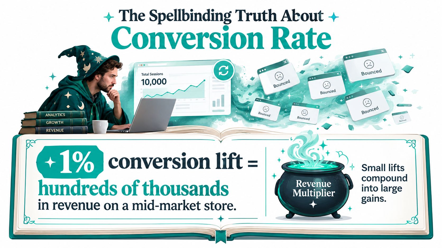
A founder opens the analytics dashboard before breakfast. Ten thousand sessions have entered the castle, and the dashboard shows a trail of bounced tabs disappearing into the mist. The founder changes the button color, refreshes the report, changes the headline, refreshes again, and briefly considers blaming the moon.
The first correction is conceptual. Conversion rate is the percentage of visitors who complete a defined action, calculated as conversions divided by total visitors, multiplied by 100. A purchase or completed signup is a macro conversion because it directly advances revenue or pipeline. An add-to-cart action, pricing-page visit, video view, or form start is a micro conversion, a smaller signal that helps explain where intent strengthens or collapses.
That distinction matters because a page can look healthy at the surface while losing people at a critical step. A landing page may attract attention but fail to generate form starts. A product page may produce add-to-carts but leak buyers during checkout. CRO isn't a vanity badge attached to a homepage. It's the discipline of finding the point where intent meets resistance.
Why small spells compound
Speed and structured experimentation are unusually dependable starting points. Google's research connects tiny performance improvements with measurable conversion movement, while industry testing benchmarks indicate that only a portion of A/B tests produce clear winners and that most completed tests deliver under 20% lift, as summarized in A/B testing statistics from Shno. That's useful news, not disappointing news. A modest improvement on a high-intent page can matter more than a theatrical redesign that creates no measurable change.
The compound effect comes from repetition. One clearer value proposition improves comprehension. A cleaner form removes hesitation. A faster checkout preserves momentum. A better post-click match protects trust. Each winning change becomes part of the next baseline, creating a moat built from accumulated learning rather than a launch-day flourish competitors can copy in a quarter.
The CRO spell: research first, state the hypothesis, test one meaningful question, document the result, and let the next experiment inherit the lesson.
Testing culture beats redesign religion because redesigns encourage teams to debate taste, while experiments force them to define evidence. The loop is simple, but it's not casual: observe behavior, identify friction, rank the opportunity, test the change, and iterate until the page earns its next improvement.
Benchmark Your Way to a Baseline Worth Trusting
A blended site-wide conversion rate is a cauldron with too many ingredients. It combines visitors with different needs, devices, traffic sources, and levels of trust, then pretends the resulting number describes one audience. It doesn't.
The available 2026 benchmark data shows why segmentation matters. One benchmark set reports a median website conversion rate of 2.35%, with the top 25% at 5.31% and the top 10% at 11.45%. Ecommerce sits around 2% to 6%, with a site-level median near 3.5%, while landing-page medians are reported around 6.6%. Those figures are directional context, not a universal target. The 2026 conversion rate benchmark review also reports much higher rates for some owned or high-intent sources than for colder acquisition channels.
Read the channel before judging the page
| Channel | Avg CVR | Mobile CVR | Intent Stage |
|---|---|---|---|
| Website overall | 2.35% median | Varies by audience and device | Mixed |
| Ecommerce | Around 3.5% site-level median | Varies by store and device | Transactional |
| Landing pages | Around 6.6% median | Varies by campaign and device | Consideration to action |
| Paid search | Around 10.9% | Varies by query and device | Often high intent |
| Paid social | Around 12% in the cited benchmark | Varies by audience and device | Discovery to consideration |
| Around 19.3% | Varies by audience and device | Warm or owned intent |
The table isn't permission to chase a benchmark. It's a warning against comparing cold discovery traffic with branded email and declaring one page cursed. Segment by source, device, geography, new versus returning visitor, product category, and funnel stage. Then examine whether the same friction appears across segments. If only mobile paid traffic struggles, the page may not be the villain. The campaign promise, audience match, or mobile experience may be.
Build a baseline that can survive scrutiny
Use a rolling window long enough to smooth ordinary fluctuations, then annotate unusual days such as outages, stockouts, major public relations spikes, or tracking failures. Don't delete inconvenient results. Record the reason for exclusion so another analyst can reproduce the decision.
A useful diagnosis asks two questions:
- Traffic quality: Do visitors arrive with the right intent, from a message that matches the page?
- Page experience: Once they arrive, can they understand the offer, trust it, and complete the action without friction?
A low rate caused by mismatched traffic won't be repaired by button polish. A strong campaign sending qualified visitors to a slow, confusing checkout needs page work. Benchmarking is the act of separating those dragons before you swing the testing sword.
Scry the Funnel With Research Before You Test
Don't queue a test because a stakeholder dislikes the hero image. Queue it because evidence points to a specific obstacle.
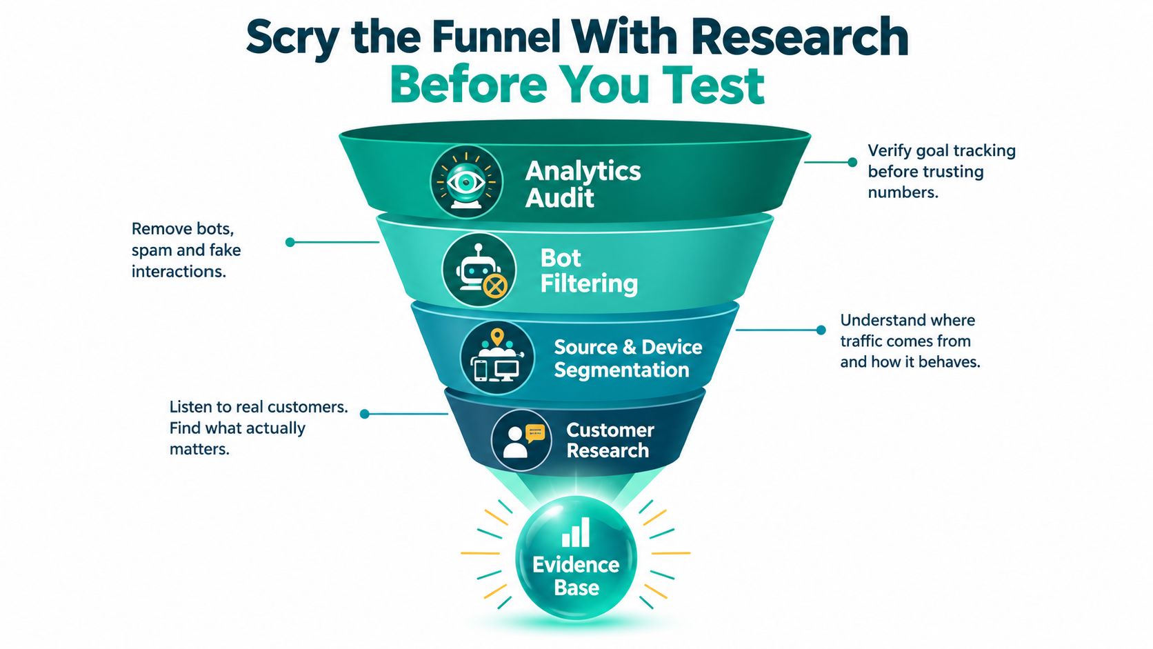
Start with an analytics audit. Confirm that the macro conversion fires once, micro conversions are named consistently, and desktop and mobile events behave as expected. Filter obvious bot traffic, then segment the funnel by source and device. A report that tracks landing session, product interaction, form start, checkout start, and completed conversion can reveal whether the largest leak sits near the entrance or beside the treasure chest.
Four lenses for finding friction
- Analytics audit: Verify goals, event firing, attribution, and funnel definitions before trusting the dashboard.
- Bot filtering: Remove non-human activity that can distort engagement and conversion signals.
- Source and device segmentation: Compare visitors who arrived through different promises and experiences.
- Customer research: Use surveys, support conversations, interviews, and recordings to hear the language of hesitation.
Heatmaps show where visitors click, how far they scroll, and which elements receive attention. Session recordings add motion and sequence. Look for rage clicks, dead taps, repeated backtracking, pauses before errors, and visitors trying to interact with decorative elements. Filter recordings to the leakiest segment instead of watching a random parade of sessions.
Ask questions that expose the obstacle
An on-page survey doesn't need to become a census. Ask a short set of questions at a relevant moment:
- What were you hoping to accomplish today?
- What nearly stopped you from completing this action?
- What information is missing?
- What alternatives are you considering?
- What would make you more confident?
Group responses by recurring friction, not by the most dramatic sentence. A single angry response may be memorable, while a repeated concern about shipping, implementation, pricing, or unclear outcomes deserves priority. Rank each pattern by frequency, severity, and revenue exposure.
Your research deliverable should fit on one page. Include the affected segment, funnel step, evidence, recurring customer language, suspected cause, business impact, and the next recommended hypothesis. That brief becomes the spellbook for prioritization rather than a graveyard of screenshots.
The strongest research doesn't tell you which color is magical. It tells you why visitors hesitate and which change could remove the hesitation.
Turn Insights Into Testable Hypotheses
Research produces observations. A hypothesis turns an observation into a decision the experiment can evaluate.
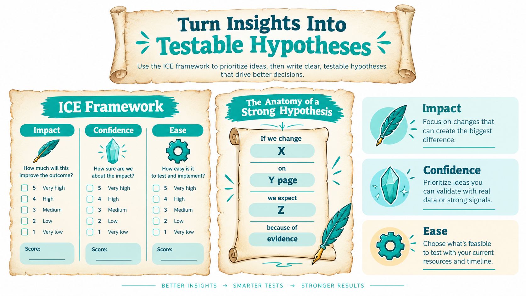
Use ICE, meaning Impact, Confidence, and Ease, or use a more granular framework such as PXL when your team needs stronger evidence requirements. The framework isn't a crystal ball. It's a queue, designed to prevent the loudest opinion from becoming the next test.
A strong hypothesis has four parts:
If we change X on Y page, we expect Z because we observed W in our behavioral and customer evidence.
“Make the page better” is not testable. “If we replace the homepage headline with a specific outcome-led promise, we expect more qualified visitors to begin the primary flow because recordings show hesitation at the current value proposition and survey responses describe uncertainty about the product's purpose” is testable.
Four useful bets
- Homepage headline swap: Replace an abstract promise with a clear customer outcome. Impact is potentially high because every segment sees the headline. Confidence is medium if the evidence comes from surveys but not from a message-match analysis. Risk is moderate because a narrower promise may improve relevance for one audience while reducing curiosity for another.
- SaaS pricing toggle: Test a clearer monthly versus annual comparison when recordings show visitors repeatedly switching between plans or returning to the pricing page. Impact can be meaningful near the decision point. Risk is higher if the presentation obscures total cost or makes the cheaper option look misleading.
- Ecommerce CTA treatment: Test clearer action wording and stronger context around the purchase button when visitors reach the product section but fail to continue. Impact may be modest, confidence depends on the observed hesitation, and risk is low if the product, price, and availability remain unchanged.
- Lead-generation form reduction: Remove fields that sales doesn't use or move qualification questions later when analytics show form starts but abandonment during completion. Impact may be high, confidence rises when the same field causes repeated errors, and risk increases if the sales team genuinely needs the missing information.
Don't pretend you know the lift before the test. Use directional expectations and define the primary metric, guardrail metrics, affected audience, variant, runtime rule, and rollout decision.
A one-page hypothesis template can be as plain as:
- Observation: What happened?
- Audience: Who experienced it?
- Funnel step: Where did it happen?
- Change: What will differ?
- Reason: What evidence supports the change?
- Primary metric: What decides the result?
- Guardrails: What must not deteriorate?
- Decision: Ship, revise, or archive?
Score the ideas, ship the highest-ICE opportunity, and park the rest. A backlog is useful only when it remembers why an idea exists.
Cast an A/B Test That Survives Peer Review
A clean A/B test begins before the first visitor is randomized. Define the baseline conversion rate, minimum detectable effect, confidence level, power, primary metric, and stopping rule. Common planning thresholds are 95% confidence and 80% power, and one CRO workflow recommends substantial traffic and conversion volume per variant before declaring a winner, as detailed in A/B testing statistics and methodology.
The sample size depends on the baseline, the effect worth detecting, and the statistical assumptions. A smaller detectable change requires more traffic. Use a sample-size calculator or a statistician-approved method rather than trusting a convenient dashboard estimate.
| Baseline Rate | MDE 10% | MDE 20% | MDE 30% |
|---|---|---|---|
| 1% | Calculate from baseline, power, and confidence | Calculate from baseline, power, and confidence | Calculate from baseline, power, and confidence |
| 2% | Calculate from baseline, power, and confidence | Calculate from baseline, power, and confidence | Calculate from baseline, power, and confidence |
| 4% | Calculate from baseline, power, and confidence | Calculate from baseline, power, and confidence | Calculate from baseline, power, and confidence |
| 8% | Calculate from baseline, power, and confidence | Calculate from baseline, power, and confidence | Calculate from baseline, power, and confidence |
This table is intentionally a planning prompt, not a license to invent a universal visitor count. The correct answer changes with the inputs and should be produced by your approved calculator before launch.
The five-step testing sequence
- Scope the question. Define one primary change and one primary decision. Keep secondary metrics as guardrails.
- Randomize cleanly. Split eligible visitors consistently, preserve assignment, and verify that analytics receives the correct variant.
- Run a full business cycle. Fix the minimum runtime before launch. Don't stop because an early result sparkles, and don't extend a test just because you dislike the outcome.
- Analyze rigorously. Use a two-proportion z-test or chi-squared test for conversion-rate comparisons where appropriate. A p-value below 0.05 is commonly used as a significance threshold, as explained by Kissmetrics on A/B testing.
- Document the decision. Record audience, dates, exposure, result, caveats, and what the team learned.
Traffic spikes, novelty effects from a dramatic new design, broken event tracking, and bot contamination can invalidate an otherwise beautiful result. Peeking at interim data and repeatedly checking until something wins also inflates false-positive risk.
AI-driven variant builders can multiply exploration by generating headline, layout, and CTA combinations, routing traffic, and surfacing likely winners. They don't remove the need for sample planning or human review. For a practical comparison of testing workflows, see A/B testing tools.
One test, one question, one decision.
Polish Speed and UX for the Quickest Wins
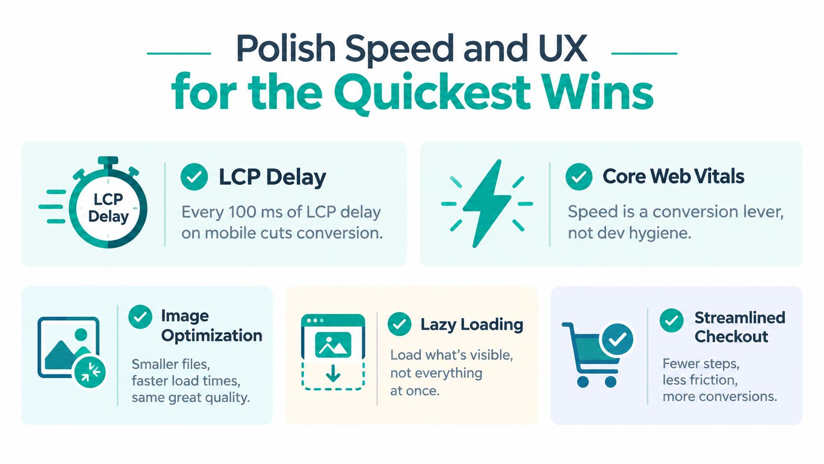
Performance is not developer housekeeping. It's part of the sales conversation. When a page renders late, the visitor experiences uncertainty before reading a single claim.
Google's mobile benchmark work found that as load time rises from one second to ten seconds, the probability of a mobile bounce increases by 123%, while the average fully loaded mobile page in the tested set took 22 seconds. Those figures appear in Google's mobile page speed benchmarks. Google's related research also associates a one-second mobile speed improvement with up to a 27% increase in conversion rates, reinforcing that incremental performance work can have commercial consequences, not merely technical ones.
Run a focused speed sprint
Start with the assets and scripts that delay meaningful content:
- Defer non-critical JavaScript: Load interaction code when it's needed instead of blocking the first useful render.
- Compress prominent media: Convert oversized hero images to efficient formats such as AVIF when browser support and visual quality allow.
- Review fonts: Reduce unnecessary font files, use sensible fallbacks, and avoid making the visitor wait for decorative typography.
- Prune third-party tags: Remove trackers and widgets that don't answer a business question or support a required experience.
- Protect the checkout path: Test product, cart, and payment flows on real mobile devices rather than relying only on a desktop emulator.
The website speed optimization guide can sit beside your technical backlog, but the priority should come from user impact. A script used by nobody deserves less patience than a payment interaction used by everyone.
Conduct a 30-minute UX audit
Spend the first few minutes completing the primary journey on a phone with one hand. Can you reach the main action comfortably? Is the cart visible when you need it? Do forms support autofill, preserve entered data, and explain errors in plain language?
Then inspect the first viewport. Does the headline explain the offer? Does the contrast support reading? Is the primary action distinguishable from secondary links? Ask a colleague unfamiliar with the page to describe what they think they can do after a brief glance. Their confusion is evidence, not an insult to the designer.
Finally, attempt failure states. Enter an invalid email, leave a required field blank, lose network connectivity, and return to the page after navigating away. A polished happy path is a pixie. A resilient error state is a trained dragon.
Speed and UX fixes form the foundation for later experiments. If the experience is slow, unstable, or hard to operate, a clever headline test is trying to cast a spell through a locked door.
Build the Daily Optimization Loop and FAQ
CRO becomes durable when it stops behaving like a campaign. The team needs a rhythm that keeps evidence moving from observation to action.
A rhythm that keeps the spell alive
Daily, take fifteen minutes. Review the experiment dashboard, flag winners ready for controlled rollout, inspect paused tests, and skim support tickets for repeated friction language. This isn't a meeting. It's a quick watchtower patrol.
Weekly, reserve ninety minutes. Score the hypothesis backlog with ICE, inspect one funnel step through recordings or heatmaps, and write one new variant grounded in evidence. Keep the session focused enough that it ends with a decision, not another ornate backlog.
Monthly, recalibrate. Recheck benchmarks by channel, retire underperforming experiments, refresh audience assumptions, and align the product or marketing roadmap with recurring CRO findings. A page can remain technically correct while its audience, offer, or objections change.
AI co-pilots work well as apprentices. They can draft copy, identify outliers, summarize session patterns, and propose variants. Humans still need to judge whether a change is honest, accessible, commercially sound, and appropriate for the audience. An autonomous agent can notice a conversion signal. It shouldn't decide that misleading urgency is acceptable.
Tools such as conversion optimization software can bring research signals, experiment management, and recurring analysis into one operating rhythm. The tool matters less than whether the team uses its output to make documented decisions.
Frequently asked questions
How long until CRO results appear?
A performance fix or clear usability repair can show a directional response quickly, but a reliable experiment needs enough exposure to meet its pre-committed design. Don't confuse an early fluctuation with a durable result. Runtime, traffic mix, conversion volume, and the size of the detectable effect all matter.
What conversion rate is realistic?
There isn't one honest universal target. The 2026 benchmarks above show wide variation by site type, channel, and intent, so compare each segment with its own history and business outcome. A higher conversion rate isn't automatically better if it attracts low-quality leads, reduces order value, or increases refunds.
Should you test pages with little traffic?
Test them when the decision is important and the team can accept a longer learning cycle. Otherwise, use qualitative research, usability sessions, and before-and-after monitoring for directional insight. Don't manufacture certainty from a tiny sample.
What happens when tests conflict?
Check audience definitions, device mix, implementation, seasonality, and primary metrics. A headline can help new visitors while confusing returning users. Segment the result, reproduce the test when justified, and document the uncertainty instead of forcing a winner.
When should you overhaul a page?
Overhaul when the page has a structural problem, a broken promise, or a funnel mismatch that small edits can't repair. Iterate when the foundation works and evidence points to a specific friction point. The best teams use redesigns to create a sound baseline, then use continuous tests to keep improving it.
Optimization compounds because every trustworthy result improves the next decision. The bigger win isn't one brilliant button or a legendary headline. It's a system that keeps the teams learning after launch.
Web Mage creates complete pages and funnels from plain-language prompts, then provides built-in agents for performance, analytics, SEO, and conversion experimentation. Use it to generate variants, monitor funnel signals, and continue the optimization loop after your first launch by visiting Web Mage.