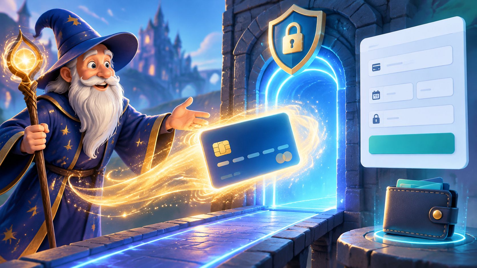
An online payment form is the secure web form that collects a customer's payment details and passes them through a payment gateway for authorization. Built well, it stands in front of a market where 64% of adults worldwide already make or receive at least one digital payment. Built badly, it's the last page a customer sees before buying from someone else.
Treat the pay button as a summoning circle. Everything before it, the browsing, the cart, the second thoughts, is preparation for the moment a visitor decides to become a paying customer. The form is where that decision completes or evaporates, and the cause is almost never the price. It's a field nobody can decipher, a wallet button that isn't there, or a ward nobody thought to cast.
Table of Contents
- What an Online Payment Form Really Is
- How an Online Payment Form Works Behind the Curtain
- The Main Types of Online Payment Forms
- How to Build a Secure Checkout Experience
- Design Choices That Stop Checkout Abandonment
- Where Conversion Meets Fraud Protection
- Cast Your First Payment Form Spell
What an Online Payment Form Really Is
A payment form collects the handful of details a customer needs in order to pay: card number, expiry date, security code, billing details, or a wallet token that stands in for the card entirely. You'll meet one on product checkouts, donation pages, invoice links, subscription signups and one-click upsell screens. All of them end the same way, with a request sent to a payment gateway for authorization.
Picture it as the summoning circle. The visitor has been circling the offer for minutes or days, and the form is the chalk outline where the deal either appears or fizzles out. Nothing else on the site gets judged this fast, because a customer standing at the pay button has already decided to spend. Everything after that decision is friction.
Fieldcraft rule: a payment form doesn't move money. It asks permission to move money, and the rest of the checkout exists to make that request clear, quick and safe.
Digital payments stopped being a niche behavior years ago. The World Bank's Global Findex 2021 found that 64% of adults worldwide, or 84% of adults who owned an account, had made or received at least one digital payment.
That average hides a split worth understanding. In high-income economies, 95% of adults used digital payments, against 57% in developing economies, where the share had climbed from 35% in 2014. In those same developing economies, 26% of adults made a digital online purchase payment, while 37% made a digital merchant payment through online or in-store channels. Plenty of that commerce runs through phones, account transfers and agents, not a card number typed into a box.
A form that only speaks card is a shop with one door on a street full of them. The choices that look cosmetic, which methods you show, which fields you demand, where the card data lives, decide whether a decided buyer becomes a customer or a bounce.
How an Online Payment Form Works Behind the Curtain
The pay button is a portal, and every portal has a route behind it that customers never see. The route runs in seven steps, and knowing them is what separates a form you can debug from a form you can only hope about.
Here's the path in miniature before we walk it.
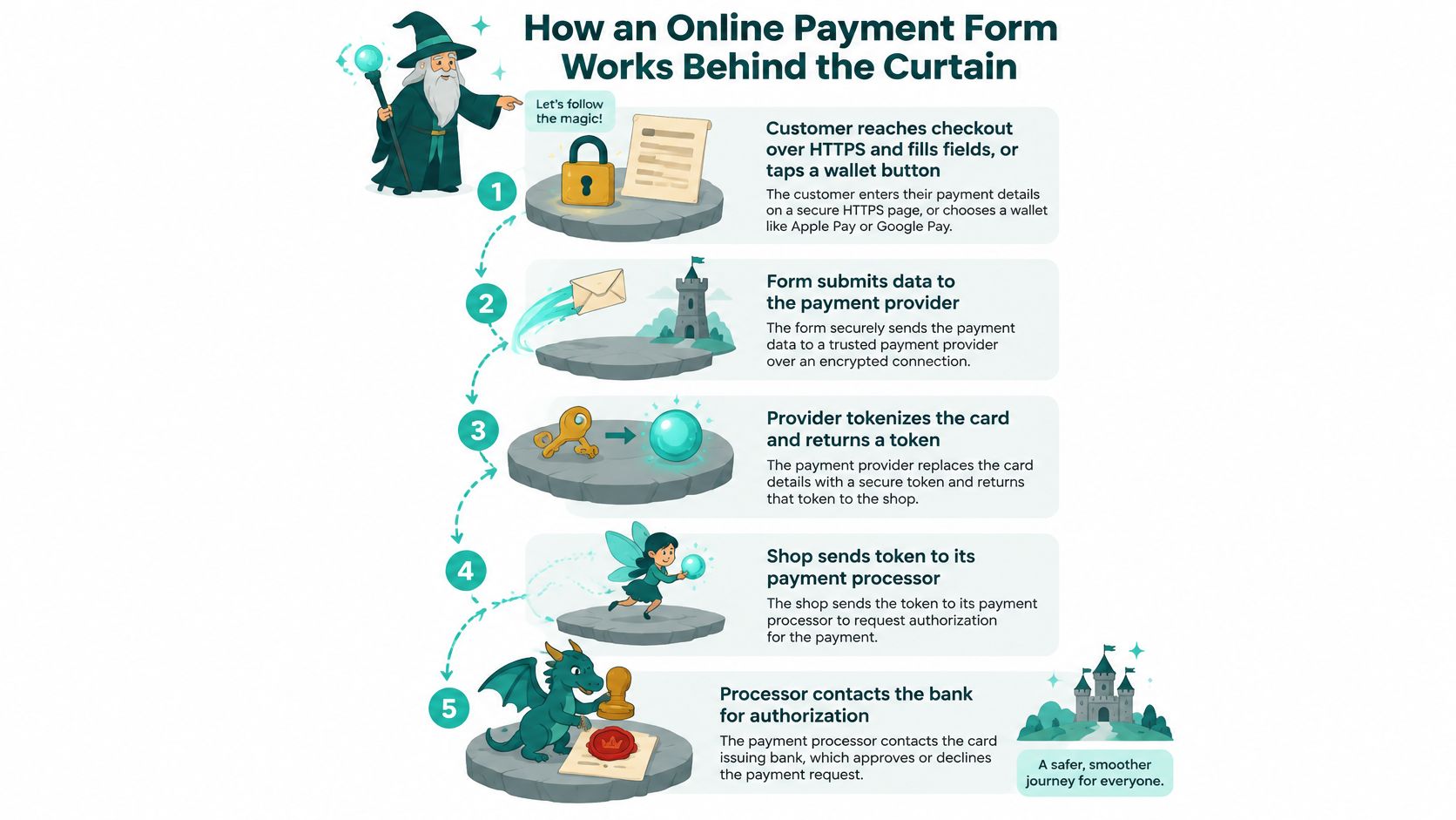
- The customer arrives at a warded gate. The checkout page loads over HTTPS, which encrypts the trip between browser and server. The customer types card details or taps a wallet button. That padlock isn't decoration, it's the outer ward.
- The form hands the card details straight to the provider. In a properly built form, the number is typed into fields the provider hosts, usually inside an iframe, and what comes back to your site is a token. A token is a stand-in, the coat-check ticket you can keep without ever holding the coat.
- The gateway opens the portal. The gateway takes that token and routes the request to the right processor and acquiring bank. It's the archmage who knows which tower handles which spell.
- The processor puts the question to the issuer. The card network identifies the bank that issued the card, and that bank runs its fraud screens. If the risk looks wrong, the customer meets 3-D Secure, a one-time code or biometric check, which is a second riddle at the door.
- The issuer answers. Approve or decline, usually with a reason attached: insufficient funds, expired card, suspected fraud, failed verification. That reason decides what the form should say next.
- The form tells the truth. Success shows a confirmation and sends a receipt. Failure shows a specific, field-level message that doesn't wipe what the customer already typed. The order gets recorded either way.
- Settlement moves the gold. Approval is a promise. Settlement is funds landing in the merchant account days later, not at the moment of the click.
The gap between step five and step seven trips up more teams than anything else in the chain. Authorization is the dragon's nod; settlement is the gold arriving in your vault. Between the two, orders can sit in limbo, which is why every serious checkout shows a payment status rather than a single vague "thanks."
Authorization is the dragon's nod. Settlement is the gold in the vault. Confusing the two is how merchants end up shipping goods against money that never arrives.
Limbo has a name in most dashboards: pending. When a payment authorizes but the order never flips to paid, the cause usually sits in the integration rather than the card, and a runbook for fixing pending orders after successful payments saves hours of guessing at webhooks and order states.
The Main Types of Online Payment Forms
Choosing a form type isn't a design decision first. It's a decision about how much card data you're willing to touch, because that single number sets your compliance burden, your liability, and how much of your week security work eats. Five architectures cover almost every small business.
| Form type | What the customer sees | Where card data is handled | PCI DSS burden | Best for |
|---|---|---|---|---|
| Hosted checkout page | A redirect to the provider's own payment page | Provider's servers only | Minimal (SAQ A) | Fast launches, solo founders, small catalogs |
| Embedded iframe form | Card fields on your page, inside a provider frame | Provider's iframe | Low (SAQ A when every card field is framed) | Brands wanting checkout on their own domain |
| SDK drop-in components | Native-looking fields and wallets in your layout | Provider handles the sensitive fields | Low to moderate | Mobile-first stores and apps |
| Direct API integration | A fully custom form you design | Your servers touch raw card data | High (SAQ D) | Enterprises with dedicated security teams |
| Digital wallet button | A one-tap wallet sheet, no manual entry | Wallet provider | Minimal | Repeat buyers and mobile traffic |
A hosted checkout page is the fastest portal to open. The provider owns the layout, the security and the updates, and you get a link or a redirect. Invoice-driven businesses lean on it constantly, and solo founders who bill through estimate and invoice software for solo service providers rarely need a bespoke checkout just to collect one payment.
The embedded iframe form is the sweet spot for most small businesses. Card fields sit inside a frame the provider supplies, so the customer stays on your domain while the sensitive inputs stay out of your codebase. You get brand control and a low compliance load in the same box.
SDK drop-in components render native-looking fields and wallet buttons inside your own layout. Choose these when most of your traffic is mobile and the visual seam of an iframe would hurt the flow.
Direct API integration buys total design control and charges for it in responsibility. Raw card data touches your servers, SAQ D becomes your problem, and the work belongs to a team with dedicated security staff and a change-control process.
Wallet buttons deserve their own row in your thinking. Worldpay's Global Payments Report found that wallets carried 53% of global e-commerce transaction value in 2024, about $3.6 trillion in online spending, a tenfold increase in wallet usage since 2014. A form without an Apple Pay or Google Pay button is asking a majority of buyers to type what they could have tapped.
Starting rule: open a hosted page or an iframe, add a wallet button in week one, and move to direct API only when you have the security muscle to match the ambition.
How to Build a Secure Checkout Experience
Security on a checkout page is a set of protective wards, and each ward earns its place by blocking a specific kind of attack. Build them in this order.
Here's the checklist as a set of wards around the checkout scroll.
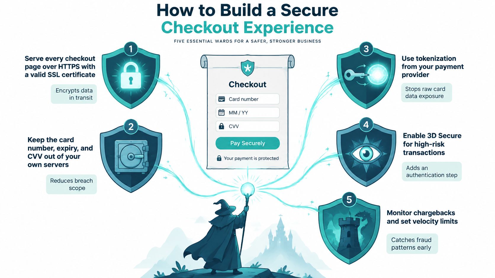
- Serve every checkout page over HTTPS with a valid certificate. Without it, details travel in the clear and modern browsers warn customers off before they finish.
- Keep the card number, expiry, CVV and cardholder name inside the processor-hosted frame. The rest of the page can be yours. Those four inputs cannot be.
- Tokenize everything. Whatever your backend receives should be a token or an order reference, never a PAN. If you can print a card number from your database, you have a breach waiting for its moment.
- Add script-integrity and anti-tampering controls. Payment pages attract script injection because that's where the money is. Subresource integrity, a strict content security policy and a review of every third-party tag belong in the build.
- Trigger 3-D Secure or risk-based authentication for risky transactions. It adds a step that a fraudster holding a stolen number usually can't clear.
- Verify the provider's PCI DSS compliance status before you sign. A frame from a provider that isn't validated buys you nothing.
- Collect only what you need, and log who touches it. Every extra field is another place to leak and another reason for a customer to leave.
The frame itself deserves a specific warning. The PCI Security Standards Council's guidance on SAQ A eligibility is precise: an e-commerce merchant using an embedded payment page qualifies for SAQ A only when every field and web element involved in capturing card data sits inside an iframe supplied directly by a PCI DSS-validated third-party provider. Merchant-controlled card fields, JavaScript payment forms and "direct post" setups fall outside that condition and can expose card data to scripts running on your own page.
A provider frame shrinks your compliance scope. It never removes your responsibility for the page around it.
That surrounding page is still yours to defend, including the copy, the layout and the confirmation flow. Our guide to a secure checkout covers the parts that live outside the iframe. Wards also need watching over time, and tightening fraud settings before chargebacks hit is the habit that keeps a quiet checkout quiet.
Design Choices That Stop Checkout Abandonment
Start with the field count, because it explains most abandonment on its own. Baymard's 2024 benchmark on checkout flow length found the average checkout contains 11.3 form fields across 5.1 steps, and 17% of users reported abandoning a purchase because the checkout was too long or complicated. The same usability testing suggests an effective checkout can run on roughly 7 to 8 form fields, or 12 to 14 total elements once checkboxes and selection controls are counted.
Where the extra fields come from
Most of the surplus is optional and nobody notices it: a second address line, a phone number used for nothing, a "how did you hear about us" dropdown crammed in before the pay button. Each one is a tiny dragon guarding the conversion gate. Defer anything you can collect after the sale, and delete anything you'd never act on.
Card fields that fight back
Card inputs are short but unusually error-prone, which is why Baymard's payment UX research lays out more than 10 design guidelines for the four core card inputs. The same research reports that 8% of users have abandoned checkout solely because a preferred third-party payment option was unavailable. Practical controls: detect the card network automatically instead of asking, accept the spacing conventions people naturally type, use proper mobile input modes, keep labels visible, add autocomplete attributes, and validate inline without shouting.
Errors that erase and customers who vanish
Error recovery is where most forms fail. Baymard's cart and checkout research collection reports that 15% of leading sites do not automatically format 16-digit card numbers, 72% create avoidable difficulty around entering expiration dates, and 59% of leading US and European sites score mediocre or worse on checkout UX. The fixes are unglamorous: screen-reader-compatible error messages tied to their field, keyboard-friendly controls, and a failed payment that preserves every valid entry.
The same research distils into a short list you can hand to a developer.
| Checkout problem | Why it costs sales | Fix |
|---|---|---|
| Average flow of 11.3 fields and 5.1 steps | 17% of users abandon checkouts that are too long or complicated | Cut to about 7-8 essential fields (12-14 elements with checkboxes) |
| Manual card-type dropdown | Extra typing and wrong selections | Auto-detect the card network from the number |
| Unformatted card-number box | 15% of leading sites skip auto-formatting 16-digit numbers | Group digits in blocks and use the right mobile keyboard |
| Confusing expiry-date entry | 72% of sites create avoidable difficulty around expiration dates | Accept MM/YY, label clearly, validate inline |
| Errors that wipe entered data | Users give up rather than retype valid details | Show field-level errors and preserve valid entries |
| Missing preferred payment option | 8% of users abandon when their wallet or method is unavailable | Offer wallets and local methods by location, device and currency |
One caveat holds all of this together. Fewer fields do not guarantee better completion. A short form with destructive error handling, a vague label and validation that fires too early can be less usable than a longer form that tells the truth. If you want a structured pass over the whole page, this guide to checkout page optimization walks through the order of testing.
Where Conversion Meets Fraud Protection
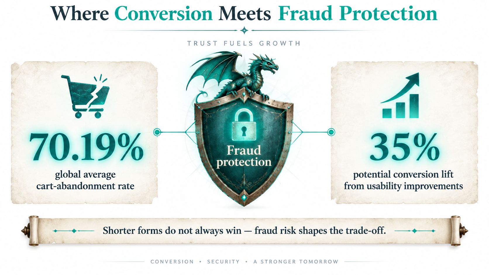
The shortest form is not automatically the richest one.
Baymard's checkout usability research puts the global average cart-abandonment rate at 70.19% and estimates that usability improvements could produce as much as a 35% conversion increase. That's the case for cutting friction, and it's a strong one. The other half of the case gets printed far less often.
Fraud arrives through the same door as revenue. The same research summarises the 2025 Merchant Risk Council report, which names real-time-payment fraud, refund and policy abuse, phishing, first-party misuse and card testing as major threats affecting roughly one-third to one-half of merchants globally, with reported fraud by order at 3.0%. Every one of those attacks enters through a payment form or the account behind it.
Adaptive checkout beats short checkout
The productive answer isn't "more friction" or "less friction." It's a form that changes shape with risk. Ask only for what the transaction needs, apply risk-based authentication so a returning customer with a clean history sails through while an odd device meets a verification step, and localise payment methods to the market. A card-first form underperforms wherever bank transfers, wallets or real-time payments dominate.
A conversion win that imports fraud and refunds is a loss wearing a victory cloak.
Judge the form on five numbers instead of one:
- Completion rate: how many started checkouts finish.
- Authorization rate: how many submitted payments the issuer approves.
- Authentication outcomes: how many 3-D Secure challenges pass on the first try.
- Chargebacks: how much approved revenue later reverses.
- Net revenue: what stays after fees, refunds and fraud losses.
A shorter form that lifts completion by a few points while doubling chargebacks is a downgrade. Track the whole funnel or the funnel will flatter you.
Cast Your First Payment Form Spell
The first spell is the smallest one that works. Pick the form type that matches your team, which for most small businesses means a hosted page or an embedded iframe, and apply the wards before you build anything: HTTPS, card fields inside the provider's frame, tokens only, script controls, step-up authentication on risky orders, and a verified compliance status.
Then trim the form to the essentials and add at least one wallet button so repeat buyers pay in a tap. Test in the provider's sandbox using its published test card numbers, walking the success, decline and authentication paths plus every field-level error state. Finish with one small live transaction and confirm the money settles into your account, because a sandbox success and a live settlement are different spells entirely.
If you'd rather spend the afternoon testing than building, Web Mage generates a checkout page and its matching thank-you page from a plain-English description of the offer, so the layout and flow are ready for your provider connection. The wider path around it is laid out in this guide to how to build a funnel. A secure, finishable checkout is a learnable spell, and the sooner you cast it, the sooner the gold arrives.
Web Mage builds the pages on both sides of your payment form. Describe your offer in plain English and it generates the landing page, checkout page, upsell and thank-you page as one connected funnel, with hosting, SSL and daily optimization agents included in a single $8 monthly plan. That means the layout, copy and flow around your payment form are ready to test instead of waiting in a build queue. Start at Web Mage and turn your offer into a working funnel this week.