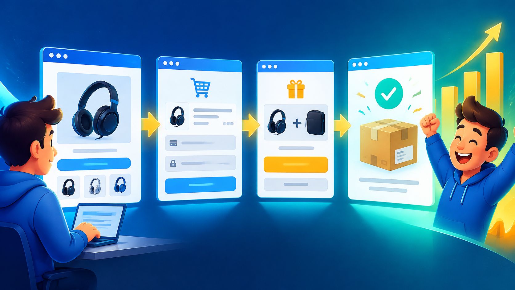
You've got an offer, an ad ready to run, and a half-built page with a button that says Learn More. Someone clicks, looks around, and disappears. You change the headline, add a testimonial, and wonder whether you need another page, another tool, or a wizard with a better hat.
Learning how to build a funnel starts with a less glamorous move: decide what each page must accomplish and how you'll know it worked. Then connect those jobs into a path that takes someone from curious stranger to satisfied buyer. The purchase matters, but so does what happens after the gold changes hands.
Table of Contents
- The Spell Map for Every Funnel Page
- How to Build Each Page and Wire the Path
- Checkout Fixes for the Vanishing Cart
- Benchmarks That Tell You the Spell Worked
- Keep Buyers After the Gold Changes Hands
- Launch Your First Live Funnel This Week
The Spell Map for Every Funnel Page
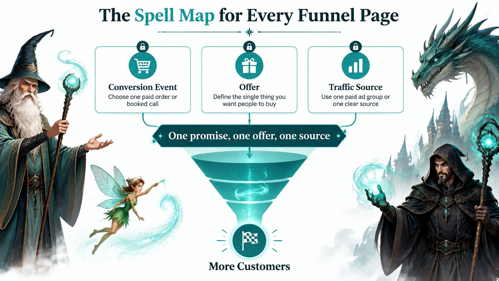
Before opening a builder, lock in one conversion event, one offer, and one traffic source. Your conversion event might be a paid order or booked call. Your offer is the thing someone receives, and your source might be a single paid ad group aimed at a clearly defined audience.
Write the promise in a sentence a stranger could repeat. Say you're selling a beginner bread-making course: Learn to bake your first reliable loaf in your home oven. That's clearer than a promise to transform someone's culinary journey through artisanal excellence.
Write the build specification
List the proof you hold: a sample lesson, photographs of the finished result, verified customer feedback, or a demonstration. Pick one optional upsell that solves the buyer's next problem, such as an advanced shaping workshop. Don't fill the tower with imaginary testimonials or unrelated treasure.
Funnel stages, pages, and the rate to watch
| Stage | Page | Single job | Rate to watch |
|---|---|---|---|
| Attention | Landing page | Repeat the acquisition promise and offer one action | Visit-to-lead or visit-to-checkout |
| Interest | Proof block on the landing page | Answer the main objection beside the offer | Scroll or click to the offer |
| Desire | Offer and pricing block | Make the outcome and price unmistakable | Click on the primary button |
| Action | Checkout | Take payment without surprise cost or a forced account | Checkout-to-purchase |
| Expansion | One upsell | Sell the next problem to the same buyer, easy to skip | Upsell take rate |
| Confirmation | Thank-you page | Deliver the asset or receipt and the next step at once | Thank-you view and follow-up start |
These are distinct jobs, not a demand for a separate URL for every row. Proof and pricing can live on the landing page. Choose the relevant rate wherever the table offers alternatives, and express engagement measures as a share of eligible visitors rather than a raw click count.
The map keeps the route visible before you start casting.
Give commitment somewhere to grow
The staged logic isn't a software invention: adesso's history of sales models traces Attention, Interest, Desire, and Action to Elmo Lewis in 1898, followed by William Townsend's funnel metaphor in his 1924 book Bond Salesmanship, applied to telephone-based selling. Visitors need different kinds of help as their commitment grows. Asking everyone to buy immediately leaves you unable to distinguish confusion from lack of interest.
Confirm your working tools: a page builder, payment processor, email tool for the handoff, and analytics capable of recording custom events. Assign responsibility for connecting them, even if that person is you wearing several wizard hats.
Practical rule: If two pages perform the same job, merge them unless you can explain the extra step's value to the buyer.
Keep the first build narrow. A dragon that hunts every village spends more time flying than eating.
How to Build Each Page and Wire the Path
Build the route before polishing its scenery. Start with the promise visitors clicked, then follow their movement through payment and delivery. Keep a test browser session open so you can experience the path as a stranger would.
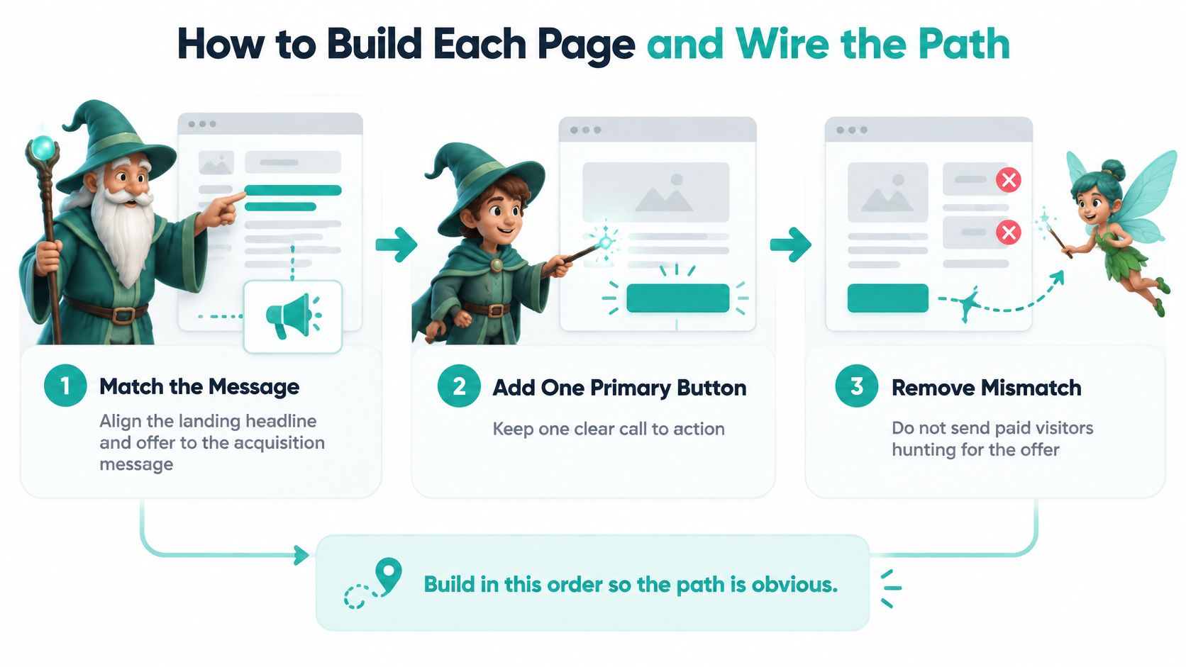
Use this opening sequence to prevent visitors from arriving at the wrong door.
Assemble the buyer's path
Match the headline and offer to the acquisition message, because visitors shouldn't have to hunt for what they clicked. If your ad promises beginner bread lessons without special equipment, put that promise near the top. Use one primary action, such as enrolling, rather than competing invitations to browse, subscribe, and book a call.
Ask only for information needed at the next step, because unnecessary questions interrupt commitment. A downloadable lesson doesn't need a postal address. A physical delivery does. Keep optional profiling questions for a later moment when customers understand why you're asking.
Place proof and objection handling beside the offer, because buyers need reassurance where they decide. For the course, show a lesson preview and explain whether a standard home oven works. Use genuine evidence, not decorative badges that imply credentials you don't hold.
Connect checkout to the selected offer, because buyers need continuity between their decision and payment. Pass through the correct product, price, and relevant options. Test the return path after a cancelled payment as carefully as the successful purchase path.
Add a relevant upsell with a visible skip, because expansion should remain a choice. State whether accepting it creates an additional charge. Declining must continue to delivery without another maze of offers.
Make the thank-you page deliver immediately, because payment or submission creates an obligation to respond. Display the receipt, asset, access instructions, or booking confirmation. Notify the person responsible for follow-up and give the customer a clear next action.
For another implementation perspective when planning recovery and follow-up, consult CartBoss strategies for funnel growth from CartBoss. Choose tactics that address an observed problem rather than adding every available automation.
This walkthrough provides another view of the build process.
Connect measurement before experimenting
Tag each transition with a distinct event, because a single purchase counter can't explain missing buyers. Use names such as
offer_view,begin_checkout,purchase, anddelivery_access. Add campaign parameters to acquisition links and preserve source attribution across the journey. Don't add fresh campaign tags to internal links if they would overwrite the original source.Calculate stage rates separately, because clicks and completed outcomes answer different questions. Track visit-to-lead, lead-to-checkout, checkout-to-purchase, and overall conversion with defined denominators. Keep paid and organic traffic separate, and deduplicate purchase events using the order identifier. Unbounce's conversion benchmark report reports industry landing-page medians ranging from 3.8% to 12.3% across nine industries, reinforcing why an unmatched overall target is weak guidance.
Test a single high-impact variable only after validating tracking, because otherwise you can't identify what caused a change. Diagnose the largest stage-level loss, write a falsifiable hypothesis, deploy a variant, and monitor the primary conversion alongside refund rate and lead quality. Record the result before changing something else.
Check the completed route on mobile and desktop, including a failed payment, skipped upsell, and successful delivery. You're ready to operate the funnel when you can name the stage with the largest loss, not merely the page you like least.
Checkout Fixes for the Vanishing Cart
Average cart abandonment is 70.19%, and Baymard's checkout usability research found that among 344 major US and EU ecommerce sites, 65% had mediocre-or-worse checkout usability while only 2% were rated good. That doesn't mean every abandoned cart was recoverable. It means checkout deserves inspection before you spend more money attracting shoppers.
Remove the unpleasant surprises
Start with the complete cost and delivery proposition. Show shipping, tax, fees, delivery timing, returns, and available payment options before the buyer's final commitment. Where an address is necessary to calculate charges, make that requirement clear and update the total promptly.
Among US shoppers who abandoned for reasons other than casual browsing, Baymard reports that 40% cited excessive extra costs, 20% slow delivery, and 19% lack of trust in card security. Treat those findings as diagnostic hypotheses for your own audience, not universal weights that predict the result of your redesign.
A shopper who needs a birthday gift won't be reassured by a shorter form if delivery arrives too late. A buyer worried about payment security needs a recognizable payment flow and clear business information, not another urgency countdown.
Use this implementation order:
- Expose the terms: Put the total, arrival expectations, returns information, and payment choices where shoppers can evaluate them.
- Allow guest checkout: Offer account creation after purchase rather than making it a toll gate.
- Cut unnecessary inputs: Baymard's ideal checkout can use approximately 12 form elements: 7 fields, 2 checkboxes, 2 dropdowns, and 1 radio-button interface. Treat that as a design reference, not a quota.
- Preserve progress: Retain entered details after validation errors and explain the correction beside the affected field.
- Keep commitment visible: Ensure customers can find the current total and primary payment action without hunting.
Diagnose before rebuilding
Record field errors, back-button exits, payment failures, and abandonment by checkout step. Review appropriately privacy-protected session recordings and run usability tests to understand what shoppers attempted. Never capture sensitive payment information in analytics.
If you're working within Shopify's checkout constraints, ServeApps' guide to reduce friction without rebuilding Shopify checkout offers a useful planning reference. Use our checkout page optimization guide to organize the broader audit around clarity, effort, and confidence.
Recovery comes last. Send relevant, consent-based follow-up that identifies the item the shopper considered and provides a direct route back. Suppress those messages after purchase, and don't invent a discount deadline to frighten someone into returning.
Fix the reason a buyer hesitates before asking an email sequence to chase them.
Benchmarks That Tell You the Spell Worked
Funnel benchmarks worth comparing against
| Measure | Reference point | Source context |
|---|---|---|
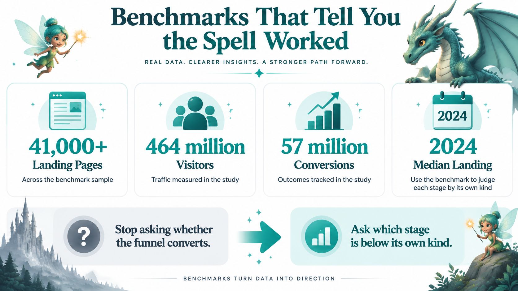
| Median landing-page conversion | 6.6% | Humblytics' account of the 2024 Unbounce benchmark, covering more than 41,000 pages, 464 million unique visitors, and 57 million conversions |
| Education landing pages | About 8.4% | Same 2024 Unbounce benchmark |
| Online-course landing pages | 18.3% | Same 2024 Unbounce benchmark |
| Industry landing range | 3.8% to 12.3% | Unbounce's nine-industry comparison |
| Visit to add-to-cart | About 6.04% | Metricuno's reported global funnel averages |
| Checkout to purchase | About 45% to 55% | Same reported funnel reference |
| Session to purchase | About 2.72% | Same overall conversion reference |
| Plain-language pages | 11%, 56% higher than eighth- to ninth-grade copy | Search Engine Journal's reporting on Unbounce in 2025, for fifth- to seventh-grade copy |
| Good Largest Contentful Paint | 2.5 seconds or less | Google's Core Web Vitals guidance |
Compare matching outcomes
A landing-page conversion might be a registration, not a sale. An online-course page and a general ecommerce session therefore aren't interchangeable comparison groups. Match your industry, traffic intent, device mix, offer, and conversion definition before deciding that a rate is weak.
Use the reference points to locate questions worth investigating, not to promise a particular result. This visual keeps the distinction between the benchmark sample and your individual funnel visible.
Suppose you rewrite a product button and more visitors add the item to their carts. Revenue can remain unchanged if those extra shoppers abandon payment, or if the new wording attracts less committed buyers. The Conversion Alchemist needs a completed-outcome measure alongside the local stage metric.
Plain language is a useful test candidate, not a guaranteed lift. Replace vague promises with concrete outcomes, explain unfamiliar terms, and put conditions beside the claim they qualify. Don't remove necessary detail merely to achieve a readability score.
Check speed and the human handoff
Inspect Largest Contentful Paint on real mobile visits. Compress oversized images, remove unnecessary scripts, and avoid lazy-loading the main hero image when visitors need it immediately. Lazy-load lower-page media instead, and retest after changes rather than assuming a smaller file solved the whole problem.
The operational handoff deserves equal attention: Vida's account of the Harvard Business Review lead-response study reports that only 37% of 2,241 audited US companies responded within an hour, while a companion analysis found that contacting a lead within an hour made qualification nearly seven times more likely than waiting another hour. Set an alert and a responsible owner, aiming for human contact inside that window. An automated acknowledgement delivers reassurance, but it isn't the same as qualifying a lead.
Testing discipline: Name the stage, state the expected outcome, and decide what evidence would make you reject your hypothesis.
Use A/B testing for websites to structure the experiment. Keep audience allocation stable, account for normal buying delays, and resist promoting a winner after a brief traffic spike. A reliable result beats a dramatic dashboard screenshot.
Keep Buyers After the Gold Changes Hands
A receipt proves that someone paid. It doesn't prove they received the product, understood it, or achieved the outcome that persuaded them to buy. Treating the purchase as the finish line leaves the most important part of the promise unmeasured.
ThinkNectar's full-funnel ecommerce framework supports extending the journey through onboarding, activation, satisfaction, repeat purchase, and referral, with separate 30-, 60-, and 90-day cohort views. A cohort is a group of customers who share a starting point, such as purchase month and acquisition source. Following that group helps you distinguish durable customer value from a temporary surge in orders.
Define the first moment of value
Write the post-purchase handoff as an observable sequence:
- Purchase: Confirm the order and record which offer and acquisition source produced it.
- Successful delivery or setup: Verify that the customer received the product or can access the service.
- First value: Identify the action that demonstrates useful progress, not merely an opened email.
- Feedback: Ask whether the customer achieved the intended result and what prevented progress.
- Repeat or expansion: Offer the next relevant purchase when behavior suggests readiness.
For the bread course, account creation is setup. Completing a first bake is a more meaningful candidate for activation. Choose an event you can measure, such as a learner-submitted completion, and make its limitations visible in your reporting.
Our thank-you page examples can help you design the immediate handoff. That page should make access and support obvious, while your subsequent messages help the buyer use what they purchased.
Send different help to different buyers
Consider a student who bought the course but never logged in. Send access instructions, explain where to begin, and offer help with setup. An advanced workshop pitch ignores the obstacle in front of them.
A student who finished the core lesson needs a different response. Ask about the result, then offer the advanced workshop if it fits their next goal. Someone who refunded should leave the upsell sequence rather than receive a cheerful pixie chorus celebrating their progress.
Keep the commercial comparison grounded in customer outcomes:
| Buyer behavior | Useful next action | Rate to watch |
|---|---|---|
| Purchased but never accessed | Resolve delivery or setup trouble | Setup completion |
| Accessed but hasn't reached value | Guide the first useful action | Activation |
| Achieved the intended result | Request feedback and offer a relevant next step | Repeat purchase |
| Refunded or reported a problem | Resolve the issue and suppress unsuitable offers | Resolution or refund rate |
Ask customers how they discovered you and what problem they intended to solve. Compare their answers with campaign attribution and the promise on the landing page.
Then evaluate acquisition spending against activation, refunds, and repeat buying. A channel with a lower initial purchase rate can still be preferable if its buyers use the product, stay satisfied, and return. If another channel brings customers who disappear before first value, inspect its audience and promise before buying more traffic.
Launch Your First Live Funnel This Week
Your pre-build checklist should fit on a short working document: a repeatable promise, evidence you can publish, a chosen conversion event, a defined traffic source, and a relevant optional upsell. Fill in the stage map before opening a canvas. Missing proof or an unclear delivery process won't become less confusing after you add animated stars.
Publish a path you can inspect
- Build the route. Assemble the landing page, checkout, optional upsell, and thank-you page around the buyer's decisions.
- Verify the instrumentation. Confirm that events fire at the correct transitions and that payment completion isn't confused with a button click.
- Send a controlled burst of traffic. Use your chosen source so you can interpret the first observations without a muddled audience mix.
- Inspect behavior after publishing. Watch stage rates, test customer support messages, and check that buyers receive what you promised.
- Change the variable linked to the clearest loss. Record your hypothesis and preserve the rest of the path while you evaluate it.
A launch is permission to learn, not permission to declare victory from a handful of visits. Spend early effort on working links, accurate prices, reliable delivery, and usable measurement before decorating the hero.
If you'd rather describe the route than drag blocks onto a canvas, Web Mage generates a live website or sales funnel from plain English, including pages, copy, images, and layout, with chat-based refinement. Building a complete 5-page funnel costs about 300 credits; that's a production option, not a substitute for deciding what buyers need.
Aim to reach Friday with a live path and a named bottleneck. That's a more useful spell than a larger collection of unfinished pages.
Bring your offer, audience, and page jobs to Web Mage, and describe the funnel you want to build. Our $8 monthly plan includes unlimited pages and funnels, 500 credits every month, hosting, SSL, a custom sub-domain, speed, broken-link and keyword patrols, monthly SEO review, and weekly analytics reading, so you can build the route and keep inspecting how it performs.