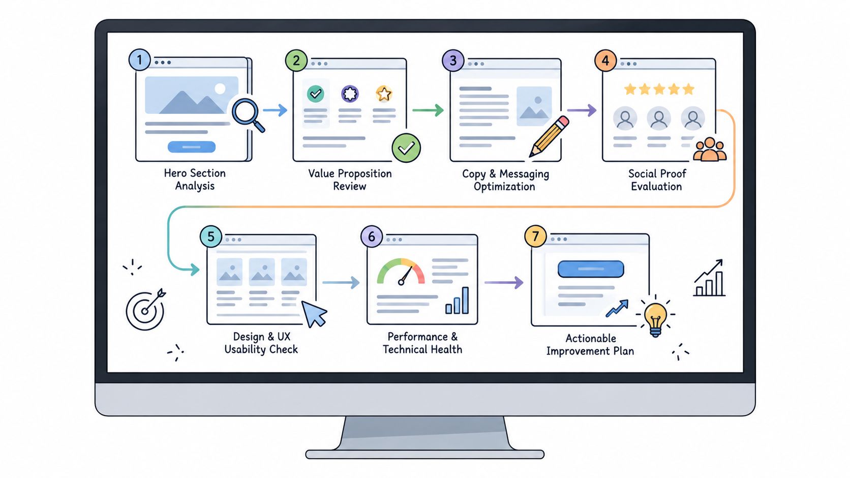
Many judge an index page by its polish. That's the wrong spell. A page can shimmer with gradients, illustrations, and animated buttons yet leave visitors unsure what the business does, why they should trust it, or what to do next. The stronger magic lies in the sequence: promise, proof, explanation, and action.
An index page can also mean more than a homepage. Historically, servers used files such as index.html as the default document for a directory, a convention supported by early web servers and still formalized by platforms such as Microsoft IIS (Web server directory index history). Modern content systems may use an index page as a navigation hub, blog listing, or documentation map.
The seven resources below cover different kinds of homepage magic, from standards-first foundations and framework starters to complete landing pages, visual template galleries, and beginner guidance. For each, inspect the page's purpose, hero message, feature presentation, trust signals, CTA logic, copy pattern, and implementation trade-offs. Then borrow the tactic, not the costume. Web Mage can turn a plain-language brief into a complete page or funnel, but the result still depends on choosing a clear audience, promise, proof plan, and CTA.
Table of Contents
- 1. HTML5 Boilerplate
- 2. Bootstrap v5 Starter Template
- 3. Start Bootstrap Landing Page Theme
- 4. Tailwind CSS Play CDN Starter
- 5. MDN Web Docs Your First Website
- 6. HTML5 UP Free Responsive Templates
- 7. One Page Love
- 7-Example Index Page Comparison
- Choose Your Spell, Then Test the Result
1. HTML5 Boilerplate
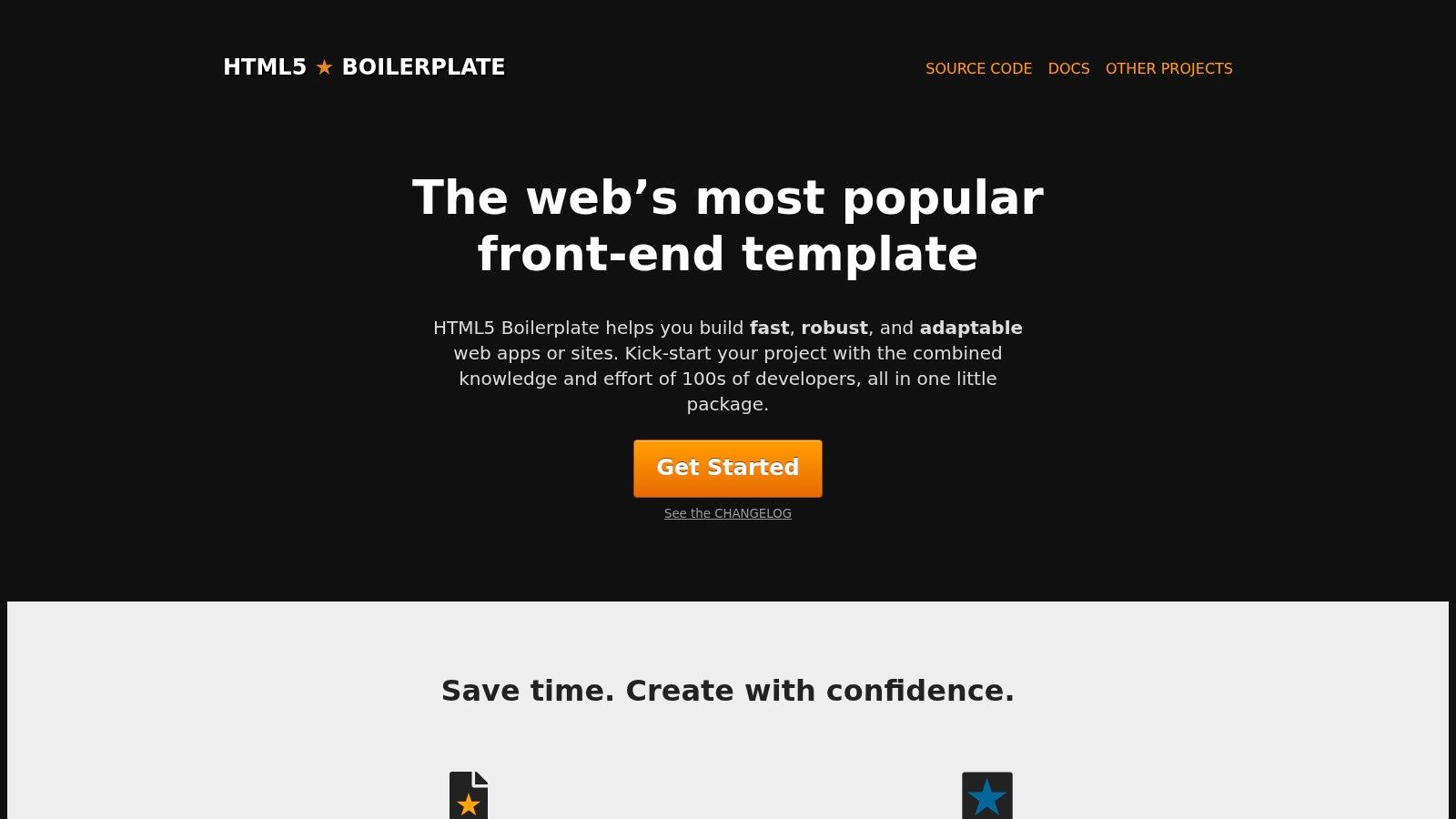
HTML5 Boilerplate is the librarian mage of index pages. It doesn't hand you a glamorous homepage with floating dragons. It gives you a disciplined index.html that's ready for careful expansion, with sensible metadata, icon and manifest hooks, script placement, and a structure designed to be trimmed or extended.
That makes its page logic unusually valuable for teaching. The “hero” is whatever you add, but the foundation encourages you to separate document metadata, visible content, scripts, and supporting files instead of throwing everything into one enchanted cauldron. It also points toward server configuration and practical front-end concerns, so you can build a page that remains understandable after the first launch.
Mage's reading rule: Before designing the banner, decide what belongs in the document head, what visitors need to see, and what the browser needs to load.
The strongest lesson here is restraint. Use the clean structure to create a homepage with one promise, a short explanation of the offer, proof that reduces doubt, and one primary CTA. Don't copy the absence of visual design. Copy the order and clarity.
The trade-off is obvious. HTML5 Boilerplate supplies no visual component library, so you'll need your own CSS, UI system, imagery, and conversion copy. It may also feel more elaborate than a bare-minimum file. That extra structure becomes useful when you're teaching a team good HTML habits or preparing a page for ongoing maintenance. Pair the starter with a practical website speed optimization guide and treat performance as part of the page spell, not a cleanup ritual after launch.
2. Bootstrap v5 Starter Template
The official Bootstrap v5 starter template opens a different portal. Instead of beginning with a completely unstyled document, it wires a minimal index page to Bootstrap's compiled CSS and JavaScript, giving you a predictable base for responsive layouts.
Read it as a framework-assisted scaffold. The hero section should make the offer immediately legible, while Bootstrap's grid, spacing utilities, buttons, navigation, and responsive behavior handle much of the structural labor. The feature presentation can use cards or columns, but the underlying tactic remains simple: group benefits into scannable units, connect each unit to a user problem, and keep the CTA visually distinct.
A useful Bootstrap homepage might follow this path:
- Promise first: State who the product helps and what outcome it supports.
- Feature proof next: Translate capabilities into benefits rather than listing technical ingredients.
- Trust before the final CTA: Add testimonials, customer logos, product evidence, or a concise explanation of how the service works.
- Action at the decision point: Give visitors one obvious next step, not a spellbook of competing buttons.
Bootstrap's ecosystem makes experimentation easy because its documentation and examples give you many patterns to inspect. The danger is visual sameness. If you copy the default spacing, buttons, colors, and card layout without changing the brand system, your page may look like a Bootstrap demo wearing a borrowed cloak.
The implementation trade-off is also practical. You get dependable responsive behavior, but the CSS and JavaScript add weight compared with an unstyled HTML file. Adapt the structure, then customize typography, color, imagery, and copy until the page sounds like your business rather than the framework's familiar incantation.
3. Start Bootstrap Landing Page Theme
Some builders need a foundation. Others need a furnished tower by sunset. The Start Bootstrap Landing Page theme belongs to the second group, offering a polished index page with a complete hero, feature sections, testimonials, and CTA areas.
Its structure is easy to read because it follows a familiar conversion narrative. The hero introduces the product or service, the feature blocks explain why it matters, testimonials supply borrowed confidence, and the closing CTA catches visitors who needed more evidence before acting. That sequence works for SaaS products, services, campaigns, and focused product pages because it answers the visitor's main questions in a natural order.
Borrow the sequence, not the stock photography.
The copy pattern is especially useful for a Web Mage-style workflow. Start with a prompt that names the audience, their frustration, the promised outcome, the proof available, and the desired action. For example, a brief might describe a funnel for independent consultants who want qualified discovery calls, supported by client results and a calendar booking CTA. The generated page should then express those facts through the theme's structure rather than filling every section with vague enthusiasm.
The page's biggest advantage is launch speed. You can download it or use the available project workflow, then replace the placeholder content and visual identity. Its MIT license permits commercial use without attribution, which simplifies deployment for many projects. Because it's built on Bootstrap, however, a bespoke result requires deliberate customization. Without that work, the page can feel like a familiar template wearing your logo.
If you're comparing this with a no-code website builder, focus on control versus convenience. The theme gives developers direct access to files and styles. A prompt-driven builder reduces manual layout work and makes conversational revisions easier.
4. Tailwind CSS Play CDN Starter
The official Tailwind CSS Play CDN starter is the quick-change mage of this group. Add the Play CDN script in the document head, use utility classes directly in the HTML, and you can turn a plain index page into a styled prototype without configuring a build pipeline.
That immediacy changes how you inspect the page. Rather than asking which prebuilt component to copy, look at the visual grammar created by the classes: spacing, type scale, contrast, rounded surfaces, responsive breakpoints, and layout relationships. A strong hero might combine a sharply specific promise with a compact supporting sentence and one CTA. Feature presentation can use a grid, but each card should explain a meaningful advantage instead of decorating the page with interchangeable icons.
Tailwind is particularly friendly to prompt-to-page iteration because small edits are visible and localized. You can ask for a darker hero, a narrower content column, stronger mobile spacing, or a more prominent CTA, then apply those changes by adjusting utility classes. Non-developers can often understand small edits more easily than they can make their way through a large component architecture.
The caveat matters. The Play CDN approach is primarily intended for development, experiments, and prototypes. Tailwind recommends a proper production build so unused classes can be removed, which makes the production setup more involved than the instant starter.
Use this example when you need to test a homepage idea quickly, not when you want to copy a finished visual identity. The repeatable lesson is to define the page's hierarchy before styling it. A sprite can change the color of a button in a blink, but it can't rescue a weak promise or a confusing action path.
5. MDN Web Docs Your First Website
The MDN Web Docs guide to creating website content teaches a quieter kind of magic. It walks beginners through a correct index.html, then adds text, images, scripts, and file organization in a clear progression.
This isn't a visual homepage template. That's exactly why it belongs on the list. MDN helps you understand the bones beneath every polished index page: headings that communicate hierarchy, links that lead somewhere meaningful, images that support the message, and files that remain comprehensible when the site grows.
Read the example as a lesson in content before decoration. A useful homepage should identify what it offers, who it serves, and how visitors can take the next step. Its sections should create doorways into deeper pages rather than forcing the homepage to explain everything. Google's guidance also favors descriptive titles, semantic HTML, and text available in the document structure, while accessibility depends on meaningful headings and organization (Google Search Central's SEO starter guidance).
A page isn't clear because its colors match. It's clear because its structure survives without them.
The trade-off is that MDN won't provide a ready-made brand system or conversion-ready visuals. You must add those yourself. For a learner, agency, or small team, that's an advantage because it prevents the interface from hiding the underlying decisions.
Use the tutorial's approach when a generated page feels impressive but difficult to explain. Rebuild the content hierarchy first, then layer in styling, proof, imagery, and interaction. A guide to building a website with AI can accelerate production, but foundational HTML knowledge helps you judge whether the generated result is sound.
6. HTML5 UP Free Responsive Templates

HTML5 UP is the visual illusionist. Its free responsive HTML and CSS templates can give a startup, portfolio, or small business a distinctive homepage without forcing the owner to design every surface from nothing.
Each template generally arrives with a straightforward file structure, an index.html, responsive layouts, live demos, and semantic HTML. That makes the gallery useful for studying composition. Inspect where the hero ends, how the page introduces features, whether imagery carries meaning or merely atmosphere, and where the template places its strongest action.
The repeatable lesson isn't “choose the prettiest template.” It's choose a layout that matches the visitor's decision. A portfolio needs visual evidence and clear project pathways. A service business may need a sharper explanation, a process section, trust signals, and a consultation CTA. A product page may need demonstrations, feature proof, objections, and purchase logic.
HTML5 UP is also lighter than many framework-heavy themes, which can make it a practical starting point for simple sites. Still, check the Creative Commons Attribution license before publishing. Attribution is usually required unless you arrange another permission, so licensing belongs in your implementation checklist alongside accessibility and responsive testing.
Treat the template as a shell. Replace generic headings with audience-specific language, remove sections that don't support the action, and make the proof credible. A polished layout can attract the eye, but only relevant evidence earns the visitor's next click.
7. One Page Love
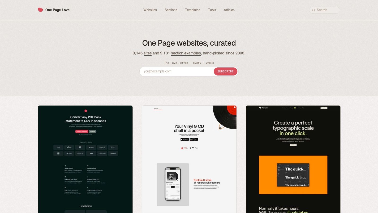
One Page Love is less a single spell and more a library of enchanted maps. It curates one-page websites and templates across categories such as landing pages and startups, giving you a broad view of how different industries handle hero sections, feature sequences, proof, navigation, and calls to action.
Because it's a gallery rather than one downloadable index.html, its value lies in comparison. Open several pages serving similar audiences and ignore their color palettes at first. Ask what each page explains above the fold, how quickly it names the problem, where it places proof, and whether the CTA remains visible after the visitor scrolls.
“Index page example” becomes a research method rather than a search phrase. A gallery can reveal recurring patterns, but recurring doesn't mean correct. Some pages use long narrative flows because the offer needs explanation. Others keep the page short because the visitor already understands the category. Your task is to identify the decision burden, then choose the amount of structure that helps visitors cross it.
One Page Love also includes templates across raw HTML, Bootstrap, Tailwind, and no-code tools. That range helps you separate content architecture from implementation technology. The same promise, proof block, and CTA sequence can be rebuilt in different systems.
The trade-off is inconsistency. Code quality, accessibility, performance, and conversion logic vary across entries, so don't treat a gallery screenshot as a technical specification. Use it to collect structural ideas, then verify the page's headings, links, mobile behavior, loading performance, and action path before borrowing anything.
7-Example Index Page Comparison
| Template | Implementation complexity | Resource requirements | Expected outcomes | Ideal use cases | Key advantages |
|---|---|---|---|---|---|
| HTML5 Boilerplate | Low, single opinionated index.html scaffold | Minimal (HTML-first); optional server configs | Standards-compliant, performance & security baseline (no UI) | Foundational projects; learning correct head/body structure | Time-tested, well-documented, easy to extend |
| Bootstrap v5 Starter Template (Official) | Low, minimal HTML with Bootstrap includes | Moderate, Bootstrap CSS/JS (no build required) | Responsive, component-ready page with predictable behavior | Quick responsive landing/homepages; bootstrap-based projects | Predictable responsiveness; large ecosystem and docs |
| Start Bootstrap, "Landing Page" Theme | Low, ready-made index with editable sections | Moderate, Bootstrap-based assets; download or npm | Production-ready, conversion-focused landing page | SaaS/product/service homepages; rapid deployment | Polished design, conversion-oriented, ready to deploy |
| Tailwind CSS Play CDN Starter (Official) | Very low for prototyping; higher for production build | Minimal for dev (Play CDN); production needs build/tooling | Fast styled prototypes using utility classes; not tree-shaken | Experiments, mocks, simple pages without build tooling | Instant styling, rapid prototyping, easy edits for non-devs |
| MDN Web Docs, "Your first website" | Low, guided, step-by-step tutorial exercises | Minimal, plain HTML/CSS/JS examples | Correct, standards-first HTML knowledge (no styles) | Learning fundamentals; teams prioritizing correctness | Vendor-neutral, authoritative, clear instructional flow |
| HTML5 UP, Free Responsive Templates | Low, drop-in templates requiring light edits | Low–Moderate, template assets and responsive CSS | Visually distinctive, lightweight one/multi-page sites | Startups, portfolios, quick visually-driven sites | Attractive out-of-the-box designs, lightweight vs heavy themes |
| One Page Love | Varies, gallery of examples rather than a starter | None to browse; linked templates/resources vary | Inspiration and real-world examples; links to templates | Finding layout ideas, benchmarking, design research | Large curated gallery across styles and industries |
Choose Your Spell, Then Test the Result
The right index page example depends on the kind of magic you need. Choose MDN Web Docs or HTML5 Boilerplate when you want a clean structural foundation and need to understand what the document is doing. Choose Bootstrap or Tailwind when a framework-assisted scaffold will speed up responsive layout work. Choose Start Bootstrap or HTML5 UP when you need a more visual launch point. Choose One Page Love when your immediate job is pattern research, not downloading a single file.
Don't evaluate any of them as a gallery of attractive surfaces. Read each page like a spellbook. Identify the audience, the promise, the evidence, and the action. Then inspect how the sections guide a visitor from uncertainty toward a useful next step.
Use this compact inspection checklist before adapting a design:
- One clear hero promise: Can a new visitor tell what you offer, who it's for, and why it matters?
- Scannable feature proof: Do the sections explain outcomes and capabilities without burying the main point?
- Credible social proof: Do testimonials, logos, examples, demonstrations, or relevant credentials reduce doubt?
- Visible CTA: Is the primary action easy to find and written as a meaningful next step?
- Mobile behavior: Do layout, text, buttons, images, and navigation remain usable on smaller screens?
- A next step: Does each major section lead naturally to a deeper page, an enquiry, a purchase, or another defined action?
Performance belongs on the same checklist. Google's Core Web Vitals guidance uses targets including LCP under 2.5 seconds, INP under 200 milliseconds, and CLS under 0.1 (Core Web Vitals guidance and thresholds). Accessibility belongs there too. Recent reporting indicates that 95.9% of the most visited homepages fail basic accessibility checks, while fewer than half pass Core Web Vitals on mobile, and a typical homepage loads an average of 59 separate images per visit (homepage accessibility, performance, and image data). Those figures make a practical point: even heavily visited homepages can leave basic usability unfinished.
Turn your chosen structure into a focused Web Mage prompt. Name the audience, offer, promise, proof assets, tone, visual direction, primary CTA, and pages in the funnel. Then refine the result through chat-based edits instead of treating the first generation as sacred. Web Mage's SEO Seer can address metadata and broken links, Speed Sprite can focus on asset compression and loading behavior, Analytics Oracle can surface drop-offs and popular sections, and Conversion Alchemist can create and evaluate CTA or layout variants.
Testing should answer a specific question. A homepage CTA experiment reported a conversion-rate change from 1.135% to 1.366%, a 20.4% increase, revenue per visitor rising from A$1.76 to A$2.10, a 19.57% increase, and estimated additional revenue of A$7,632 per month (the cited homepage CTA case study). Treat that as an example of why a structural change deserves measurement, not as a promise for every site. Statistical A/B testing depends on control and variant groups, expected traffic, and significance checks, which are described by SearchPilot's SEO testing platform.
The strongest index page example isn't the one you copy most closely. It's the one whose message, evidence, structure, and action path fit your audience, then improve as real visitors reveal where the spell fizzles.
Web Mage turns plain-language briefs into complete websites and funnels with page structure, copy, imagery, styling, hosting, SSL, and chat-based editing. Describe the audience, promise, proof, and CTA you want in your index page, then visit Web Mage to turn that structure into a working page you can refine.