
The average large e-commerce site could achieve a 35.26% increase in conversion rate by resolving solvable checkout usability issues. Conversion rate optimization UX works because removing friction often earns more sales than attracting more visitors.
Think of your website as a wizard's market stall. Traffic brings a crowd to the tent, but user experience determines whether visitors can complete the buying spell. A slow page, an unexplained form field, or a checkout that demands an account can turn eager shoppers into vanishing wisps.
CRO isn't about tricking people into clicking. It's about making the intended action clear, trustworthy, and easy to complete. The strongest improvements usually come from observing where users struggle, testing a focused remedy, and measuring completed actions rather than celebrating a temporary omen.
Table of Contents
- Why UX Is the Core of Conversion Magic
- Diagnosing User Flow and Friction Points
- Simplifying Forms and Layouts for Smooth Conversion
- The Critical Link Between Speed and Retention
- Automating Optimization with Magical Familiars
- Choosing Prompt-to-Page Over Rigid Templates
- Mobile Friction Versus Simple Responsiveness
- Mastering the Art of Conversion Alchemy
Why UX Is the Core of Conversion Magic
A merchant can attract visitors through search, advertising, or social content, then lose them at checkout when the path feels hostile. Analysts at Baymard found that across 16 years of large-scale checkout testing, the average large e-commerce site could gain 35.26% in conversion rate by fixing solvable checkout usability problems, as documented in Baymard's checkout usability research.
That result sets the order of operations. Extra traffic cannot repair a leaking funnel. If product information is unclear and checkout behaves like a warded gate, paying to bring in more visitors only sends a larger crowd into the same maze.

The hidden treasure is already in the funnel
A visitor may arrive ready to compare a product, check delivery, confirm payment options, and buy. Each extra decision draws from a limited attention spell. An unclear message raises doubt, while an unexpected cost makes the visitor recalculate the value of the purchase.
Conversion rate optimization UX treats these moments as clues. The working question is simple: what is stopping a motivated person from completing the action? Forms, page speed, mobile layouts, and checkout messages act like magical wards. A well-configured Web Mage familiar can identify and repair some of these obstacles automatically, while teams verify the result through testing.
Baymard's benchmark of more than 180 leading e-commerce sites found that 64% of desktop checkouts and 63% of mobile checkouts delivered a mediocre or worse user experience, according to its checkout usability benchmark. The finding points toward practical repairs: show costs clearly, reduce unnecessary form work, offer guest checkout visibly, and explain errors in language users can act on.
Wizard's rule: Repair the bridge before inviting more magical visitors across it.
UX is a revenue discipline because design choices shape understanding, trust, and task completion. CRO adds a testing loop, allowing teams to replace assumptions with observed behavior and turn scattered friction into focused improvements.
Diagnosing User Flow and Friction Points
A user flow is the route from first arrival to completed action. Draw it as a path through your castle, then mark every gate, corridor, and locked door. A typical commerce journey might include a landing page, product discovery, product evaluation, cart, checkout, payment, and confirmation.
The mistake is to inspect only the final conversion number. A visitor may leave because the offer is wrong, because the page fails to answer a question, because a button is hard to use, or because the checkout suddenly introduces an obligation. Each cause needs a different counterspell.
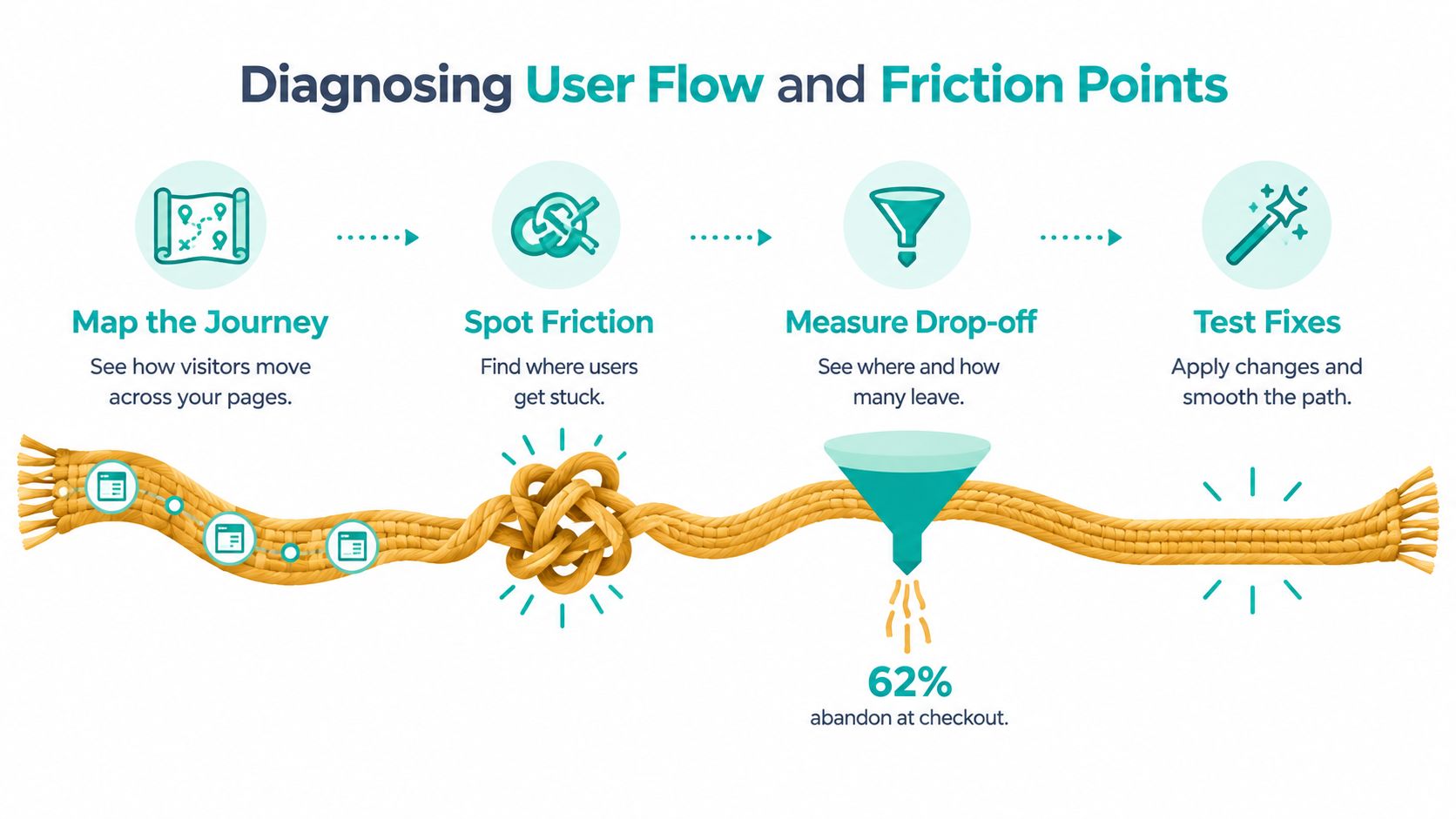
Four observations reveal the blocked path
Map the journey. List the actual pages and actions required for the primary conversion. Include redirects, modal windows, login prompts, payment errors, and confirmation steps. A clean-looking funnel can hide a surprisingly long route.
Spot hesitation. Look for repeated clicks, backtracking, abandoned fields, error messages, and moments when users pause before continuing. Analytics shows where the drop occurs, while recordings, surveys, and usability sessions help explain why.
Measure drop-off by stage. Compare movement between stages instead of treating the funnel as one container. If users reach checkout but fail to complete payment, rewriting the landing page won't solve the immediate ward.
Test one focused remedy. Remove a field, clarify shipping costs, change the order of information, or improve the error message. Keep the hypothesis specific enough that the result teaches you something.
Case-study content can also reduce uncertainty before a visitor begins the buying journey. An analysis of 10,000 agency websites reports that sites featuring case-study-driven content had 167% higher conversion rates, while detailed client success stories were associated with 43% shorter sales cycles, according to the supplied agency content conversion study. Treat that finding as a directional editorial insight, then validate whether proof content helps your own audience.
For experiment design and platform comparisons, use this guide to A/B testing tools. The useful question isn't which page looks more magical. It's which version helps more qualified users complete the intended action without creating downstream problems.
Simplifying Forms and Layouts for Smooth Conversion
A form can become the strongest ward in a checkout, blocking a ready buyer with every unnecessary question. Baymard reports that the average checkout contains 11.3 form fields, and 22% of users have abandoned because checkout was too complex, according to its current state of checkout UX research. Each field asks for another moment of attention when buying intent is already fragile.
Account creation casts a second gate. A Baymard survey found that 18% abandoned because they didn't want to create an account. Let guests complete the immediate purchase, then offer account creation after the order, when the customer has received value and the spell feels rewarding rather than restrictive.
A practical form-clearing ritual
Begin with an inventory of every field. Ask which decision or operational requirement it supports. Delivery calculations, payment processing, fraud prevention, fulfillment, and buyer communication may justify an input. A field with no clear purpose deserves removal from the incantation.
Refine the fields that remain:
- Remove unnecessary inputs. Fewer fields reduce typing, validation errors, and visual noise.
- Explain sensitive requests. Baymard reports that 14% of users abandon when a phone number is required, while 39% of e-commerce sites fail to explain why the phone field is needed, according to its checkout usability report. If the number supports delivery or fraud checks, explain that beside the field.
- Make guest checkout prominent. Baymard found that 62% of sites fail to make guest checkout the most prominent option, according to the same report. Keep the low-commitment path visible instead of hiding it behind a secondary link.
- Expose costs early. Show shipping, tax, payment limitations, and delivery expectations before final confirmation whenever possible.
- Design for correction. Preserve entered information, identify the exact error, and explain the fix. A vague red glow is a curse, not guidance.
Layouts need the same discipline. Group related fields, establish a clear visual order, and keep the primary action easy to find. The page should guide the hand like a well-drawn spellbook, with each step answering the question raised by the one before it.
Test a reduced-field checkout against the current experience while protecting shipping, tax, payment success, and fraud-screening requirements. Measure completed orders, not only progress to the next step. A shorter form that increases payment failures is a mischievous familiar, not a successful spell.
The Critical Link Between Speed and Retention
Speed is a conversion spell with a short fuse. Baymard's UX statistics overview reports that 40% of visitors leave when a website takes more than three seconds to load. A delayed page withholds the very evidence visitors need to judge value, trust the offer, and choose the next action.
Mobile users meet an even stronger ward. The same source reports that mobile users are five times more likely to abandon a task when a site is not optimized for mobile. Performance therefore belongs inside the conversion journey, alongside messaging and interaction design, rather than in a separate SEO chamber.
Find the heavy charms
Begin with the first meaningful content and the first usable conversion action. Large images, autoplay media, unused scripts, third-party widgets, and oversized fonts can postpone the moment when visitors understand the offer.
A practical performance pass includes:
- Compressing assets: Reduce image weight while preserving the detail needed for product evaluation.
- Lazy-loading media: Load below-the-fold images and video as they approach the viewport.
- Pruning bloat: Remove scripts, plugins, animations, and tracking that serve no clear business or measurement purpose.
- Testing real devices: A page that feels quick on a powerful laptop may still frustrate visitors using a constrained mobile connection.
- Protecting the conversion prompt: Make the headline, key proof, price, and primary action available early.
A concrete improvement might reduce Largest Contentful Paint from 2.4 seconds to 1.1 seconds. That change gives the page's main promise a chance to appear before impatience closes the gate.
A speed report shows the spell's timing, while behavior reveals its commercial effect. Compare exits, form starts, checkout progression, and completed actions across meaningful device contexts. If a faster page hides the offer or disrupts interaction, the spell has changed shape instead of improving.
For a hands-on technical checklist, use this guide to optimize website speed. The goal is a faster, calmer route from intent to action, not a decorative score.
Automating Optimization with Magical Familiars
Automation can turn conversion optimization from an occasional ritual into a watchful practice. Daily CRO work includes observing behavior, creating variants, directing traffic, and reviewing results. Human teams can manage these tasks, yet deadlines and client requests often push them aside. Autonomous agents work like magical familiars, keeping watch over the funnel while humans set objectives, safeguards, and success measures.
The first spell is detection. An analytics agent can flag a checkout step with unusual abandonment, a form field visitors repeatedly correct, or a device context where an important action fails. A content agent can draft a different headline or explanation. An experimentation agent can divide visitors between a control and variant, then summarize the result for review.
Platforms like Web Mage illustrate this pattern. Its Conversion Alchemist drafts A/B variants, allocates traffic, tracks significance, and promotes winners automatically. Its Analytics Oracle identifies drop-offs and stalled visitors, while its Speed Sprite compresses assets and lazy-loads media. Together, these familiars connect experiment management, behavioral diagnosis, and performance maintenance.
A study of 50,000 sessions in 2025 reported that AI-supported recommendation approaches raised conversion from 6.2% to 12.8%, with further optimization to 14.5%, as described in the academic study. Treat that result as one experiment, not a prophecy. Results can differ by site, audience, implementation, and personalization method.
Before a familiar promotes a change, make it pass several wards:
- Statistical validity: Optimizely identifies 95% statistical significance as an accepted standard and says binary metrics require at least 100 visitors or sessions and 25 conversions in both variation and baseline before declaring a winner, according to its sample size guidance.
- Segment checks: Review device, audience, acquisition source, and new-versus-returning behavior.
- Business quality: Check completed orders, payment errors, refunds, support contacts, and retention signals where available.
- Privacy boundaries: Collect and infer only the personal information the experience requires.
- Rollback rules: Set the conditions that stop a variant and restore the control.
The familiar should speed up disciplined experimentation, not crown a noisy early lead as permanent law.
Automation earns its place when it preserves judgment. Let agents handle repetitive monitoring and variant production. Humans still decide what the business can safely optimize and which customer experience boundaries must remain guarded.
Choosing Prompt-to-Page Over Rigid Templates
A rigid template can become a conversion ward. Traditional drag-and-drop builders offer shelves of blocks, which suit a simple launch, but those blocks also dictate the page. Teams may force an offer into the wrong sequence, keep unused sections, and polish visual details that do little for the visitor's task.
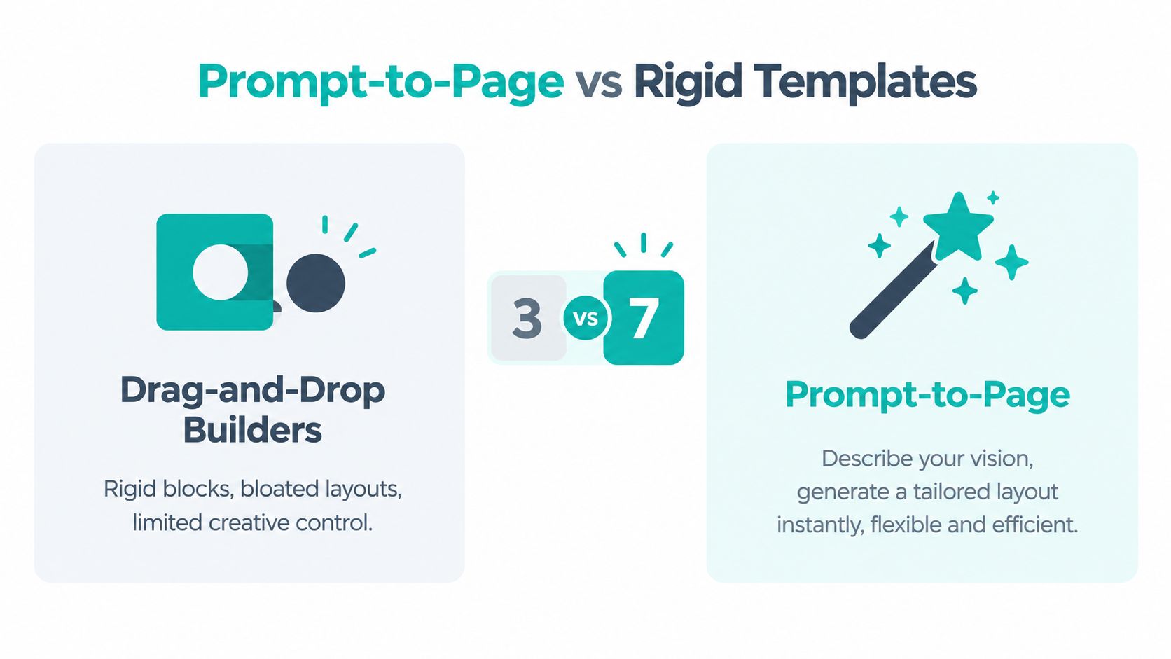
Prompt-to-page generation begins with intent. Describe the audience, offer, tone, proof, action, and constraints, then let the system shape a page around that brief. A request such as “Create a comparison page for cautious SaaS buyers, place security proof beside the signup form, and keep the primary action visible on mobile” can produce a focused structure. A drag-and-drop result may instead begin with a hero block, feature grid, and generic call to action merely because those components are available.
Two approaches, two kinds of work
| Drag-and-drop builder | Prompt-to-page workflow |
|---|---|
| Select blocks and assemble the page manually | State the audience, offer, task, and conversion goal |
| Fit the message inside available components | Generate a custom-structured page and refine it through instructions |
| Rebuild related funnel elements by hand | Create connected pages from one offer and customer journey |
| Inspect results after manual edits | Combine generation with analytics and controlled experiments |
Generated pages are not automatically persuasive. They still need accurate claims, accessible interactions, clear pricing, and credible evidence. Their practical advantage is faster iteration. A strategist can request a comparison section, a clearer guarantee, or a shorter checkout flow without rearranging every component by hand.
Web Mage's autonomous agents act like familiars around the workshop. They can help produce related landing, checkout, upsell, and thank-you pages from one brief, while chat-based editing applies broad changes consistently. An SEO crawler can inspect metadata and broken links as the site changes. Teams learning how to build a website with AI should still review each generated result.
Distribution begins after the page is ready. Choose channels that match the audience and the offer, then measure engagement and conversion by source rather than assuming the page alone will create demand.
Use prompt-to-page when speed and flexibility matter. Give the familiar precise instructions, inspect every claim, test the experience, and refine the page according to user behavior. That discipline turns automation from a shortcut into a useful spell.
Mobile Friction Versus Simple Responsiveness
Responsive design changes the layout. Mobile CRO changes the task. A page can fit a narrow screen and still make buying difficult because the keyboard covers the button, autofill inserts the wrong value, a consent dialog blocks the content, or the payment fields demand awkward navigation.
Recent benchmark material reports that 84% of mobile users encountered obstacles completing website tasks on smartphones, while mobile conversion rates in several datasets were approximately 2.2% to 2.9% on mobile versus 4.3% to 5.1% on desktop, according to this mobile usability benchmark discussion. These figures don't identify the cause for every business, but they show why “it responds correctly” isn't the same as “it converts well.”
Build a mobile friction map
Separate the journey into tasks rather than screens:
- Discovery: Can visitors identify the offer without dismissing intrusive overlays or scrolling through decorative content?
- Evaluation: Can they compare options, read essential details, and find trust information without losing their place?
- Form completion: Does the correct keyboard appear? Are fields large enough to tap? Does autofill work without creating validation errors?
- Payment: Can users review totals, select a method, and recover from failure without restarting?
- Post-click confidence: Does the confirmation page explain what happens next and preserve trust?
Test these paths with the devices and input methods your audience uses. Watch for accidental taps, horizontal scrolling, clipped messages, sticky elements covering actions, and fields that reset after an error. Analytics can identify the stage where users disappear, while session recordings and short usability tests can reveal the interaction that caused the escape.
A mobile friction map also clarifies priorities. If discovery is healthy but form completion collapses, redesigning the hero image is a distraction. If payment fails for one browser family, a general responsive rebuild may miss the actual cause.
Mobile optimization means respecting attention, fingers, keyboards, connectivity, and context. The best page isn't merely a smaller desktop page. It's a focused path that helps a person complete a task with the tools in their hand.
Mastering the Art of Conversion Alchemy
Conversion rate optimization UX becomes reliable when you treat it as a cycle rather than a one-time redesign. Observe the journey, identify the ward, form a hypothesis, test a focused change, and inspect the result beyond the first encouraging shimmer.
The core craft has four connected disciplines:
- Diagnose behavior. Map the route and separate discovery, evaluation, form, payment, and confirmation problems.
- Remove effort. Simplify fields, explain necessary requests, expose costs, and make the next action unmistakable.
- Protect momentum. Improve loading performance and design mobile interactions around completion, not just visual adaptation.
- Automate carefully. Let agents monitor patterns and prepare experiments, while humans enforce privacy, quality, statistical, and rollback rules.
Each discipline supports the others. A faster page won't rescue a form that demands unnecessary commitment. A shorter form won't help if the payment action is hidden behind a mobile overlay. An automated test won't teach you much if it optimizes a shallow intermediate click while completed orders decline.
The master's question: What did the user try to accomplish, where did the path resist them, and what evidence would prove that the next version helps?
Keep a change log. Record the problem, hypothesis, audience, primary metric, guardrails, and decision rule before launching an experiment. That record turns scattered tweaks into institutional knowledge, so the next spell begins with what the last one taught you.
A conversion-focused site should feel less like a maze and more like a well-marked path through an enchanted forest. Visitors still make the decision themselves. Your job is to remove needless uncertainty, effort, delay, and distrust from the route.
Web Mage creates prompt-generated pages and funnels, then supports ongoing CRO with agents that monitor analytics, improve speed, repair SEO issues, and run A/B variants. Visit Web Mage to turn your next conversion journey into a clearer, faster path for real users.