
A memorable business website does more than look polished. It guides attention, explains value, removes doubt, and makes the next move obvious, which is why business website examples are really conversion playbooks in disguise. That matters even more now that websites are close to universal in major markets, with one roundup saying 83% of small businesses now have a website, up from 64% in 2018, while another dataset says 73% of U.S. small businesses had a website in 2023 and 12% launched one in the prior year (Network Solutions). In other words, the question isn't whether a business has a site, it's whether the site acts like a good wizard or a decorative spellbook.
These seven sources each answer a different strategic question. Some show structure, some show styling, some show landing-page mechanics, and one shows how to keep improving after launch with Web Mage. The useful lens here is simple, structure, copy, CTA design, conversion hooks, practical limits, and the lesson you can steal without copying the whole potion.
Table of Contents
- 1. Web Mage
- 2. Awwwards
- 3. SiteInspire
- 4. Land-book
- 5. Lapa Ninja
- 6. Landingfolio
- 7. One Page Love
- Top 7 Business Website Showcases Comparison
- Cast the Right Spell on Your Next Site
1. Web Mage
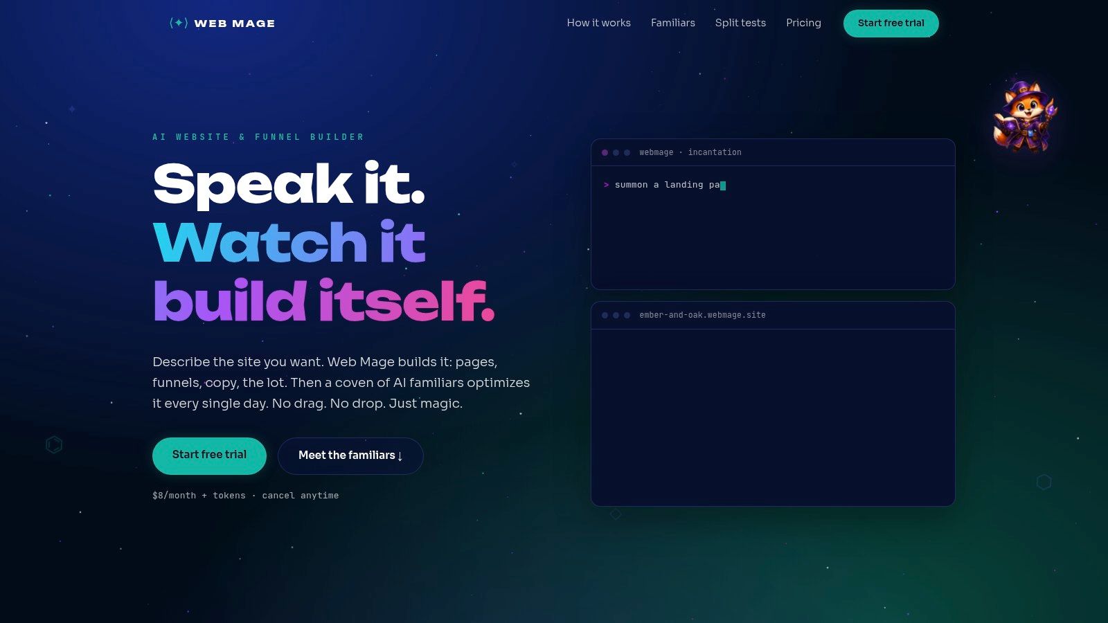
Web Mage is the source I'd hand to a founder who needs a site that behaves like a working system rather than sitting static like a brochure. It turns plain-language prompts into pages, copy, imagery, styling, and connected funnels, then keeps improving the site through autonomous agents. For business website examples, that matters because it shows the full loop, launch, measure, refine.
Why it stands out for practical builders
The strongest feature is the familiars system. SEO Seer rewrites metadata, repairs broken links, and checks keywords. Speed Sprite compresses assets and lazy-loads media. Analytics Oracle highlights drop-offs and higher-value pages. Conversion Alchemist drafts A/B variants, routes traffic, tracks significance, and promotes the better performer. That moves Web Mage beyond basic site building and into ongoing optimization, which is the part many small teams struggle to keep up with.
The pricing model is also unusually easy to plan around. The plan is $8/month, includes 500 monthly credits, a 14-day free trial, and a custom .webmage.site subdomain. Extra 1,000-credit top-ups cost $20, and purchased credits never expire. Common actions have published credit costs, so you can estimate recurring work instead of guessing what each edit will cost.
Practical rule: if your team cannot justify separate tools for SEO, speed, analytics, and split testing, one system that handles all four is easier to maintain and easier to measure.
The trade-off is clear. AI-first speed does not replace bespoke brand craft. Human review still matters for legal copy, compliance, and any voice that needs a precise rhythm. For solo founders, agencies, course creators, and growth teams, though, it is a strong answer to a familiar problem, launch fast, then keep improving without adding a maintenance headache.
Pros:
- End-to-end automation: Prompt-to-page generation and one-sentence funnel creation can produce a launch-ready site and wired funnel quickly.
- Daily optimization agents: SEO, speed, analytics, and conversion work keeps moving after launch.
- Predictable costs: The flat plan and published credit usage make planning easier.
- Built-in testing: Split tests happen inside the platform.
- Fast edits: Chat-based changes reduce fiddling.
Cons:
- Limited disclosure on advanced enterprise needs: The public material is light on custom domain depth, enterprise integrations, and plugin ecosystems.
- Human review still matters: Brand nuance and compliance need a person in the loop.
- High usage can cost more: Heavy iteration can burn through credits.
2. Awwwards
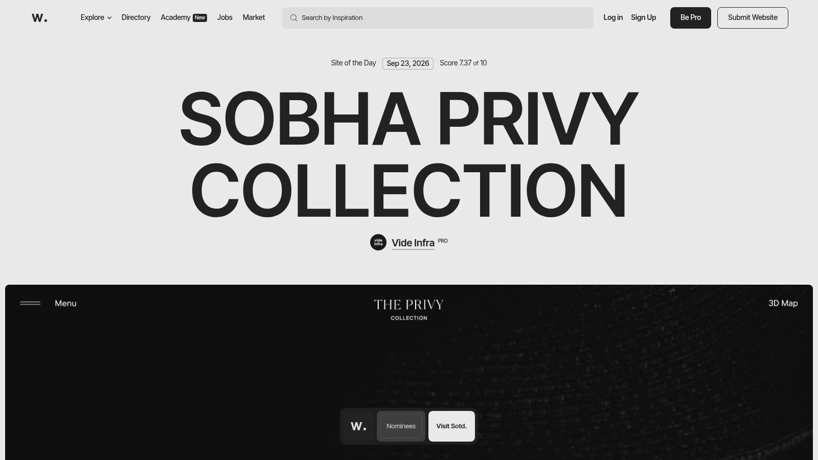
Awwwards is where you study the polished end of business website examples. It shows how premium brands use motion, layout, and interaction to signal confidence, then turn that polish into a clearer first impression. If Web Mage is the working wand, Awwwards is the museum piece.
Best for trend spotting, less for copying
Its curation tiers, Nominees, Site of the Day, Site of the Month, and Site of the Year, help you separate strong execution from noise. The category filters make it easier to study Business & Corporate, E-commerce, or Architecture sites, and the stack filters show whether a look depends on Webflow, Shopify, React, or GSAP. That matters when you want to know if a pattern is mostly visual direction or a result of the build stack.
The trade-off is straightforward. Many featured sites are agency-grade builds, so the visual work can be expensive to reproduce and harder to maintain on a lean team. Awwwards is strong for pacing, hierarchy, and interaction ideas, but it is a poor blueprint if your team needs pages that ship quickly and stay easy to update.
Speed matters here because motion only helps if it supports comprehension. If animation slows the page or distracts from the offer, it weakens the result. For a practical look at that balance, how to optimize website speed is a useful companion.
A beautiful site that loads slowly is still a leaky bucket.
Use Awwwards to study polished patterns, then strip them back to the business job they need to do. The useful takeaway is usually cleaner hierarchy, sharper CTA placement, and an interface that feels confident without piling on effects.
3. SiteInspire
SiteInspire is the steadier research source in this set. It curates high-signal examples with faceted filters, so you can move from inspiration to layouts you could ship. For business website examples, that makes it useful when you want patterns that feel practical instead of staged for awards.
A better fit for client pitches and practical layouts
The filter structure does a lot of the work. You can browse by Type such as E-Commerce or Portfolio, by Style such as Minimal or Grid, by Subject, and by Platform. That helps when you need to match a client's industry and tech stack to an example that does not imply a full rebuild.
SiteInspire also links to designer and agency profiles, which makes it easier to trace who made the work and spot repeated habits across projects. You start seeing the same useful patterns in strong business sites, clear navigation, strong above-the-fold value, and modular sections that keep the scroll readable. That is the value here, pattern recognition with context.
It still has limits. You do not get much technical metadata, so there are no built-in performance or SEO notes. It is also more click-through oriented than media-rich, which means you often need to visit the live site to judge motion, pacing, or responsiveness. That works well if you are studying design language. It is less helpful if you want to audit conversion mechanics in one pass.
For teams that like a layout and want a faster route from research to build, Web Mage's no-code website builder guide is a useful next stop. It bridges the gap between finding the idea and launching something without a production mess.
Use SiteInspire when you want good bones. The gallery shows discipline in layout, not spectacle.
4. Land-book
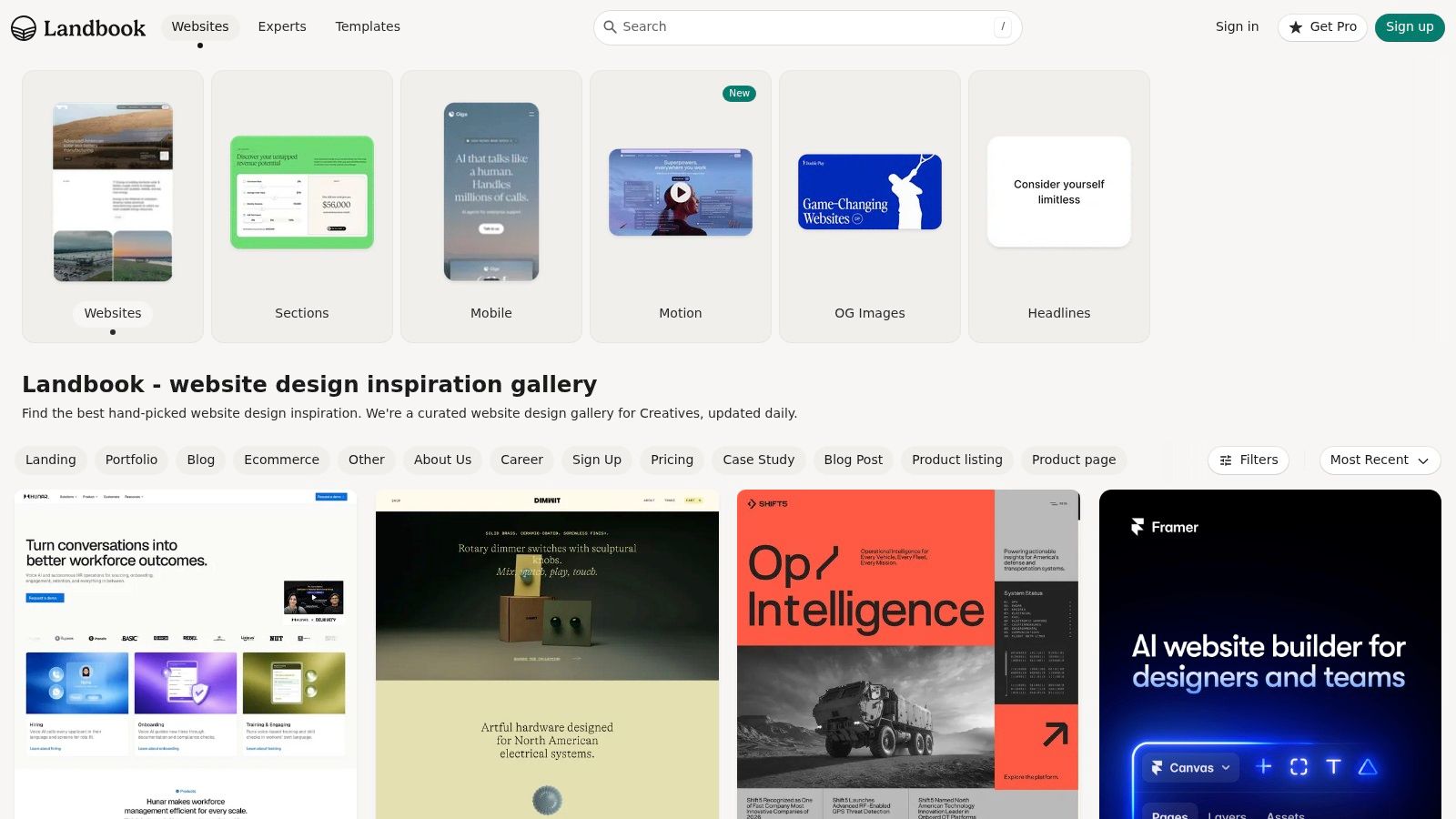
Land-book is the place to use when you need cleaner research by vertical. Its filters for Industry and Platform make comparison straightforward across business models, whether you are studying AI, Finance, Local Business, Real Estate, or SaaS. Where Awwwards rewards spectacle, Land-book rewards comparison work.
The best choice for comparing conversion elements
The dedicated sections for Motion, OG Images, and Headlines make this archive especially useful for practical review. You can separate visual polish from conversion logic and study the parts that shape a homepage or landing page. That matters for marketers who want to see how a headline, hero image, or social preview supports the offer.
Land-book also includes save and copy tools, which helps when you are building a swipe file for internal review. I use it for “show me five versions of this same business problem” research because the filter depth makes side-by-side comparison much easier. You can compare a finance site with a SaaS site without digging through unrelated creative portfolios.
There is one caution. Some listings are templates, so you still need to check whether you are looking at a live business site or a theme product. Community like counts are also a weak popularity signal, not a quality measure. Treat them as a weak signal, not evidence.
For teams using AI to draft landing-page copy, the companion guide at Web Mage's AI landing page copy generator pairs well with this kind of research. Land-book shows the visual pattern. That guide helps turn the pattern into language.
Practical rule: if you cannot explain why the headline works, you do not really know why the page works.
5. Lapa Ninja
Lapa Ninja is built for people who care about landing-page mechanics more than broad brand storytelling. It has a large, frequently updated archive with business and corporate filters, plus historical captures that make iteration easier to study. For conversion work, that is exactly what conversion research needs.
Strongest for hero, pricing, and CTA patterns
The archive includes 7,000+ curated websites and 15,000+ full-page screenshots with filters by industry, platform, colors, and year. Those figures matter because they show the gallery has enough depth to support real comparative research, not just one-off scrolling. The board and saving system, available on Pro, helps teams build a focused swipe file instead of a chaotic folder of screenshots.
What makes Lapa Ninja useful is the emphasis on conversion-critical sections. You can quickly inspect how different business pages handle the hero block, how they position pricing, and what their CTA hierarchy looks like. Historical versions and video recordings are especially useful when you want to see what changed between one version and the next.
The limitation is structural. A lot of the archive is built around landing pages, so it will not cover multi-page service sites well. Some entries are screenshots only, which means you still need to check the live page for real behavior. If you are looking for service pages with multiple content layers, this archive will not always fit.
Use Lapa Ninja when the question is, “What should the first screen say, and what button should follow?” That is where it earns its keep.
6. Landingfolio
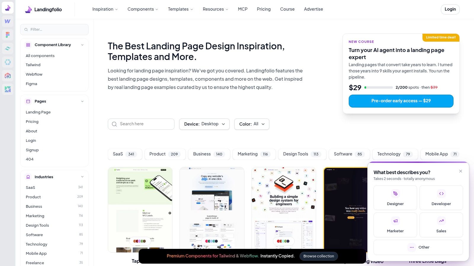
Landingfolio sits between inspiration and execution. It suits teams that want landing-page ideas and reusable components, especially when they build with Tailwind or Webflow. For practical business website examples, that matters because the goal is not to admire patterns, but to ship them.
Good for turning inspiration into a build
Its industry filters for SaaS, Business, Corporate, and Fintech keep the archive commercially focused. The component library is the draw, because reusable blocks let teams move faster from concept to production, and they help when you want to test a section without rebuilding the whole page. That is a practical edge over galleries that only show screenshots.
The platform also points you toward conversion work through its A/B testing and optimization resources. You are not just collecting patterns, you are also getting a prompt to examine how a page earns clicks. I like it for teams that need a quick start on pricing sections, feature grids, or testimonial blocks without losing room to customize the final page.
The limit is familiar. Landingfolio leans heavily toward landing pages, so it will not teach much about deep content architecture or multi-layer navigation. Component reuse helps speed execution, until every site starts to look like every other site built from the same blocks. Customization still matters if you want the page to feel like your brand, not a stack of borrowed parts.
If you are building the copy side of that process, Web Mage's landing page copy guide gives you a useful companion. Landingfolio supplies the structure, then you can sharpen the words that sit inside it.
Practical rule: use component libraries to speed up execution while keeping the strategic thinking in-house.
7. One Page Love
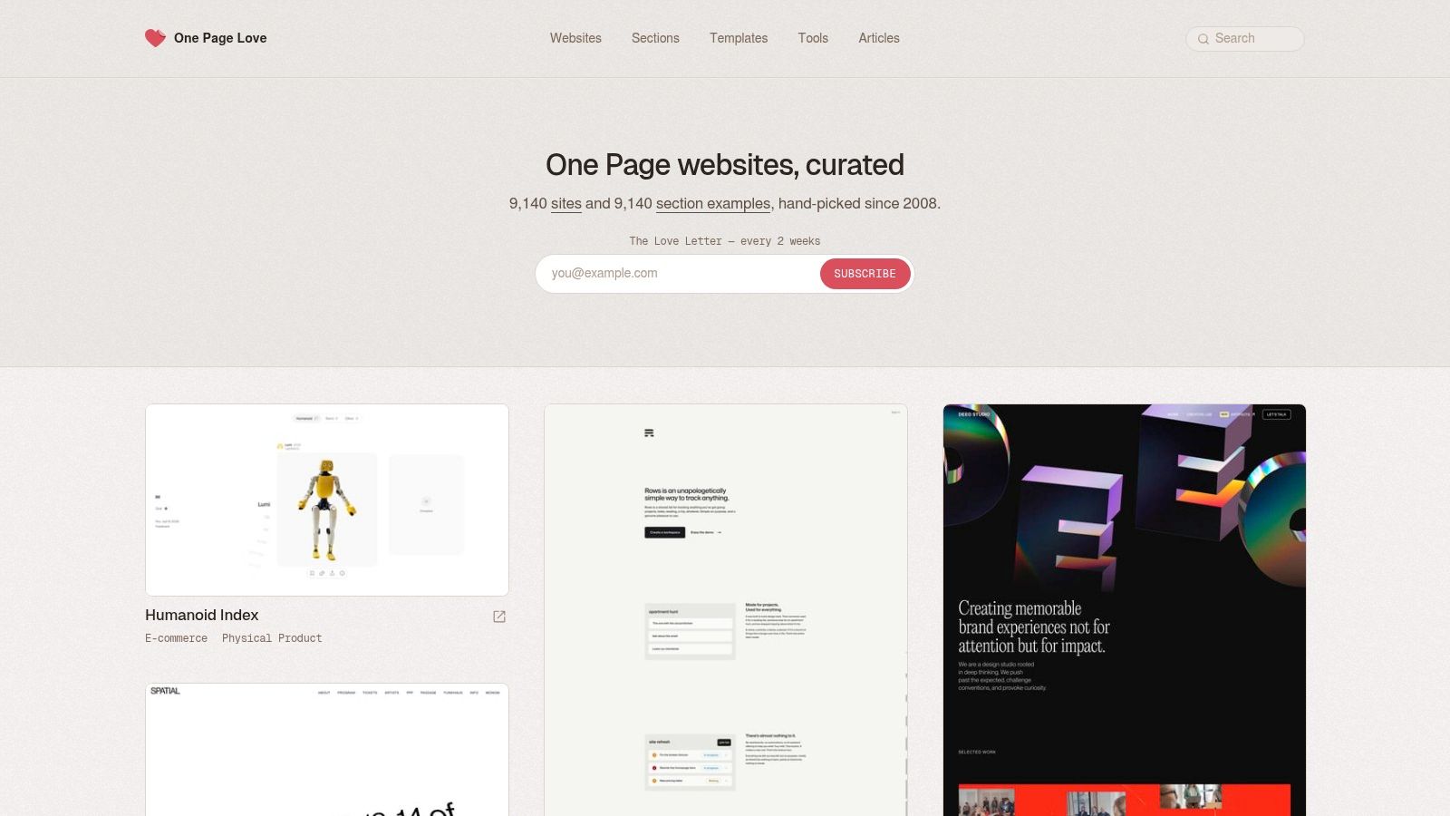
One Page Love is the archive to open when a single-page flow is the right answer. It fits funnels, launches, events, and service businesses that do not need a sprawling site to convert. For that job, it is one of the clearest references you can study.
Best for fast-launch flows and scannable structure
The archive has collected thousands of one-page sites and section examples since 2008. That long run matters because it gives you historical breadth, not just current trend chasing. The sections library is useful for pricing, features, and other conversion blocks that need to land quickly.
This is the source to study if you are building a compact sales flow or a minimum viable site. It shows how headline density, CTA repetition, and section order affect clarity on a page with little room to waste. For event promos or webinars, that lens is practical, not decorative.
The weakness is easy to spot. A single-page bias will not teach much about complex information architecture or content hubs. Technical metadata is thinner than you would want for serious SEO or performance analysis, so you still need other tools for the backend analysis. One Page Love focuses on clarity and pace, not deep-site plumbing.
If your business only needs one decisive path to action, this gallery is a strong teacher. If you need layered navigation, product education, and repeated trust-building, it covers only part of the job.
Top 7 Business Website Showcases Comparison
| Item | Implementation complexity | Resource requirements | Expected outcomes | Ideal use cases | Key advantages | Key limitations |
|---|---|---|---|---|---|---|
| Web Mage | Very low, prompt-to-page + chat edits; automated nightly ops | Low ongoing cost ($8/mo + credits); managed hosting & SSL; credit management for heavy use | Launch-ready sites and funnels; continuous SEO, speed, analytics and conversion improvements | Solo founders, small businesses, agencies, course creators, growth teams needing fast funnels | End-to-end automation; built-in A/B testing; nightly AI optimizations; predictable credit pricing | May lack enterprise integrations/custom domain clarity; AI output may need human review; heavy use incurs credit top-ups |
| Awwwards | Low for browsing; high to reproduce awarded designs | Time to research; potentially high dev/design budget to replicate premium builds | Inspiration and trend signals; examples of high-craftsmanship sites | Creative directors, agencies, teams seeking premium/art-directed inspiration | Curated, high-quality examples; filters by category and tech; trend tracking | Bias toward high-budget aesthetics; may prioritize style over performance or ops |
| SiteInspire | Low, practical, shippable layouts to adapt | Moderate dev effort to implement chosen designs | Grounded, industry-appropriate site layouts ready for adaptation | Client pitches, startups, teams needing realistic templates by industry/platform | Good balance of polish and practicality; faceted filters and profiles | Less per-entry metadata (no performance/SEO notes); no built-in video captures |
| Land-book | Low, focused examples and elements for research | Quick research time; useful save/copy tools | Comparative examples across verticals; specific conversion elements (motion, headlines, OG) | Matching examples to tech stack/sector; conversion element research | Business-focused filters; sections for motion/headlines/OG; efficient vertical comparisons | Includes some templates among live sites; community metrics not rigorous |
| Lapa Ninja | Low to use; replication requires dev work | Extensive archive browsing; optional Pro for boards/saving | Conversion-focused section examples (hero, pricing, CTAs); historical comparisons | Landing-page benchmarks, pricing/hero layouts, iteration analysis | Large archive with full-page screenshots and historical captures; strong business filters | Many entries are screenshots only; emphasis on single-page/landing-page formats |
| Landingfolio | Low, provides ready components for drop-in use | Component libraries (Tailwind, Webflow); moderate dev to integrate | Rapid implementation of landing components; faster A/B testing | Teams wanting copy-paste UI blocks, landing pages, quick iterations | Component library + templates and optimization tips; industry filters | Focused on landing pages; component reuse can lead to repetitive patterns |
| One Page Love | Very low, single-page templates and sections | Minimal for one-page builds; template recommendations speed launch | Fast-launch funnels, event pages, MVP one-pagers | Funnels, launches, event promos, service businesses using single-page flows | Large sections library and templates; highly scannable examples for headlines/hero/pricing | Single-page bias, not suited for complex IA or multi-page sites; limited technical metadata |
Cast the Right Spell on Your Next Site
The best way to use business website examples is to match the gallery to the question you're asking. If you want premium visual direction, start with Awwwards. If you want practical layout patterns, use SiteInspire or Land-book. If you need landing-page mechanics, go straight to Lapa Ninja or Landingfolio. If the job is a single conversion path, One Page Love is the cleanest mirror in the room. And if you want a site that doesn't just launch, but keeps improving, Web Mage belongs in the workflow.
Before you copy anything, inspect the page hierarchy first. Read the promise, the CTA, the proof, and the friction reducers in that order. Then ask what the page is doing for the visitor, because the best sites don't win by decoration alone, they win by making the next decision feel obvious. That's the spell, reducing uncertainty until action feels natural.
Use the galleries as analysis tools, not costume racks. A headline that works on a landing page might fail on a service site. A dramatic hero might help a premium brand and hurt a local business. A multi-step funnel can outperform a single page, but only if the flow matches how the buyer thinks. Adapt the pattern to the intent, then trim the excess.
The final move is testing. If you rebuild a section, run the change against the version you already have instead of assuming the prettier one is better. That's where Web Mage fits especially well, because it can generate, test, and refine the page without turning every update into a manual project. A beautiful idea becomes useful only when it survives contact with data, and that's where magic starts.
If you want to turn these examples into a site that keeps getting better after launch, Web Mage gives you the prompt-to-page speed, funnel wiring, and daily optimization layer to do it. Build faster, test smarter, and let Web Mage help you turn inspiration into a living business website instead of another saved screenshot.