
Where the magic begins is a conference room, not a tower. Your product team has argued over a button color for three weeks. A rival ships a test and settles the same fight in an afternoon. You are in that room now, with a page that almost converts, a Slack thread full of taste, and nobody willing to lose the argument.
This guide opens the spellbook on eight real A/B tests from Google, the Obama 2008 campaign, Bing, Booking.com, Netflix, Wikimedia, Etsy, and Amazon. Each one is told as a spell recipe. The hypothesis is the incantation. The variants are the potions. The metrics are the omens. You get the scene, then the change, then the score the team could defend.
An A/B testing example belongs here only when people were randomized and a metric was named before anyone cheered. Hunches, executive taste, and "it looks more premium" do not count as proof. A few of these cases have numbers a careful reader can trace. Others are famous stories with softer paperwork. Every entry ends with a tactic you can rerun on your own traffic, plus a plain note on which claim the public record supports. The list starts with a color so small most wizards would have ignored it.
Table of Contents
- 1. Google's 41 Shades of Blue, the Enchanted Hue Duel
- 2. Obama 2008 Campaign Splash Page Sorcery
- 3. Bing's Ad Headline Experiment, the Revenue Charm
- 4. Booking.com's Thousands of Concurrent Experiments
- 5. Netflix's Artwork Personalization, the Thumbnail Enchantment
- 6. Wikimedia's Donation Banner Testing, the Scroll of Generosity
- 7. Etsy's Feature Flags and Search Experiments, the Marketplace Spell
- 8. Amazon's Latency Experiments, Every 100ms Matters
- How the Eight Famous A/B Tests Compare at a Glance
- Your Spellbook for Running Tests That Actually Win
1. Google's 41 Shades of Blue, the Enchanted Hue Duel
Search results are a night market, and the links are lanterns. Google's first reported search-results test, in 2000, was not about hue. It asked how many results a page should show. By 2011 that workshop had become a habit. G2's A/B testing statistics notes the company was reportedly running more than 7,000 A/B tests a year.
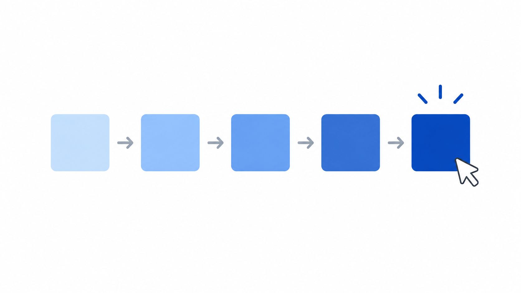
The later incantation was almost rude in its smallness. If the blue of a link or an ad shifts by a hair, clicks will shift with it. The potions were roughly 41 shades, each shown to its own slice of searchers. The omen was click behavior, not a design critique. That same account says reports attributed roughly $200 million in additional annual advertising revenue to the slightly purpler winner, and it treats the sum as an estimate, not a formally audited causal result.
Copy the hue duel without the circus
Change one lantern. Test link or button color before you touch layout, offer, or headline. Distrust a crowd of shades. Many variants at once can crown noise unless you correct for multiple comparisons. Keep the till separate from the tale. Huge traffic can turn a tiny click change into real money. Your own test still has to show it.
A pretty blue is not a strategy. A click metric named before launch is.
Say a coach page uses navy links on cream. Run two or three blues on those links only, same offer, same button. If the range of plausible results stays wide, you do not have a champion color.
Public record: the 2000 test, the later yearly volume, the shade count, and the warning that the revenue figure is an estimate. It does not give you a formula for your button.
2. Obama 2008 Campaign Splash Page Sorcery
A primary campaign is a funnel with a deadline. The splash page is the gate. In 2008 the digital team did not debate the gate in a war room until everyone was tired. They treated the sign-up screen as a potion shelf. Media and the button had to work as a pair, because a warm photo with a cold button is a broken spell.
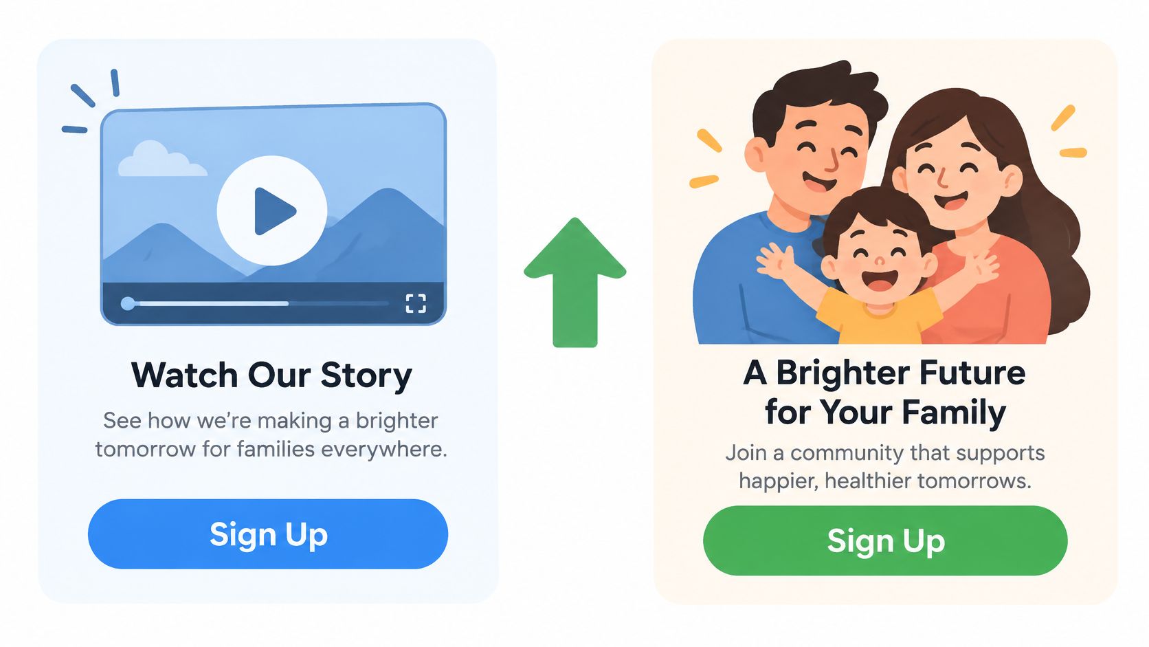
The incantation was about list growth, not vibes. A different mix of media and call to action would bring more email sign-ups. The potions paired a video or a family photo with buttons in the spirit of "Learn More" or "Sign Up Now." The omen was sign-ups, one primary conversion, agreed before the first visitor landed. Interaction is the point. A photo can lift a bold button and sink a soft one, and you will never see that if you test the pieces on different weeks.
A splash page you can actually run
Pair the potions. Test media and copy together when you suspect they interact, and keep the offer identical. Name one omen. Email sign-ups, or booked calls, or checkouts. Secondary metrics can watch, they cannot steal the verdict. Write the page so the test is fair. If you are still shaping the control, start with a clear A/B testing setup for websites before you invent twelve heroes.
A course creator can mirror this on a webinar gate. Same promise, two scenes (a talking-head video, a student photo), two buttons. Ship the pair that fills the list, then test the next pair against that winner.
Public record: this is a widely retold political testing story, and a precise sign-up lift is not pinned to a source in this spellbook. Copy the design, which is combinations plus one primary goal. Do not tattoo a percentage onto your forecast.
3. Bing's Ad Headline Experiment, the Revenue Charm
In 2012 a Bing engineer wanted a small change in how ad headlines were shown. The idea sat in the backlog for more than six months. It looked low priority, and it needed only a few days of engineering. Managers did not get to bless it by taste. The team ran an online controlled experiment, old headline presentation against the new one.
The incantation was commercial and narrow. Clearer headline formatting would raise revenue without bruising the searcher's experience. The potions were two displays of the same ads, not a new auction and not a new offer. The omens were revenue, watched beside user-experience guardrails. Within hours the lift looked too large, so the team hunted for a bug. Kentico's account of the Bing headline test says the change increased revenue by approximately 12% without harming key user-experience measures, and Harvard Business Review reported more than $100 million in additional annual revenue in the United States alone.
Guardrails before you scale the charm
Watch satisfaction next to cash. A revenue win that annoys searchers is a cursed coin. Re-test a fast miracle. Early novelty can inflate a result that later fades. Do not let the backlog be the judge. A few days of work can hide a fortune, which is why A/B testing for marketing starts with a metric, not a meeting.
Say your ecommerce ads all shout the brand and whisper the product. Test a headline format that leads with the product, same bids, same landing page. Promote it only if revenue rises and return rate, or complaint rate, stays calm.
Public record: the backlog delay, the roughly 12% revenue increase, the clean user-experience check, and the United States annual figure above are what this account supports. It is one of the few charms in this book with a receipt.
4. Booking.com's Thousands of Concurrent Experiments
Say a booking team is changing its search cards while another is adjusting the checkout steps. A traveler may encounter both changes in one visit, making it harder to tell which one affected a booking. Booking.com became known for a culture where teams could run experiments without waiting for a central approval. In public talks about this approach, guardrails matter because simultaneous changes can interact.
Spellbook entry: Keep the tests from colliding
The incantation: a local change to search, price presentation, or booking steps may affect whether travelers progress toward a booking. Nearby experiments should not take credit for one another's results.
The potions: variants on those surfaces, each with a primary metric chosen before launch. The omens: booking progression, rather than a designer's preference. Overlap is the hazard. If one test changes price and another changes the same card, the result may not show which change made the difference.
Keep a registry or don't run a crowd
List every live spell. Record active experiments so teams can see when tests might overlap before they share traffic.
Choose the omen in advance. Set a primary metric and a significance threshold before launch. That makes it harder to select a flattering result after the test ends.
Choose tools that can manage overlap. A guide to A/B testing tools can help you compare options for isolating experiments, rather than changing a button.
Say a small agency is working with three client hotels. It can test a change to search cards and a separate change to a later checkout step during the same week, as long as the tests affect different pages and both teams record them where they can be seen.
The repeatable tactic is simple: list each test, its surface, and its primary metric before launch, then check the registry for collisions. Booking.com's concurrent testing culture and its attention to guardrails are the parts of this example supported by the public account. Treat “thousands” as a sign of scale, not a figure to quote; the useful lesson is keeping concurrent tests visible so they do not contaminate each other.
5. Netflix's Artwork Personalization, the Thumbnail Enchantment
The queue is a wall of doors. The thumbnail is the knocker. Netflix has described artwork as something the service tests and personalizes, not a poster the art team hangs and forgets. A close-up of the lead and a wide shot of the crisis are different promises, even when the title is the same.
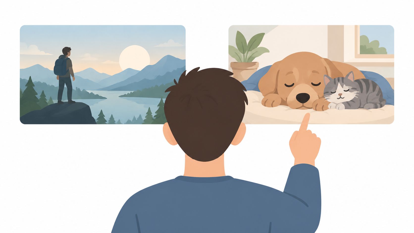
The incantation is about starting, not admiring. The image on a title changes whether a member presses play. The potions are thumbnail variants for one title, dealt to different viewer segments. A face, a scene, a prop, a mood. The first omen is the click. The omen that matters is the play, and what happens after the play starts. A lurid frame can win the click and lose the hour.
Test angles, then watch the second room
Swing the creative wide. A new angle beats another shade of the same frame. You are testing a promise, not a tint. Score the downstream act. Plays, finishes, or repeats. The first click is a doorbell, not a sale. Segment on purpose. A thumbnail that wins for one taste can repel another. Do not average those guests into one bland winner.
A course seller can do the smaller version on a sales hero. Three images, same headline, same price. One is the teacher, one is a student result, one is the workbook. Judge paid enrollments, not hero clicks.
Public record: Netflix has publicly treated thumbnail choice as a real driver of whether members start watching. This entry does not attach a percentage to that influence. Steal the surface, which is artwork plus a downstream metric.
6. Wikimedia's Donation Banner Testing, the Scroll of Generosity
Fundraising banners are polite bandits. They interrupt a reader who came for an article, and they ask for a gift. Wikimedia teams regularly test those banners and the pages behind them. They vary framing, imagery, suggested amounts, and the words on the button. Because many of those experiments are published, the work is a field manual for anyone testing messages on a busy, mission-led site.
The incantation splits in two, and that split is the whole lesson. An emotional appeal may raise the donation rate, while an informational appeal may raise the average gift, or the reverse. The potions are banner variants, heart versus facts, different suggested amounts, different verbs. The omens are donation rate and average gift, read together. Optimizing only the rate is how you fill a hat with coins and call it a dragon's hoard.
Two omens, or the spell lies
Pair rate with value. A cheaper win can shrink the average gift and leave the campaign poorer. Watch fatigue. A banner that wins in week one can go stale if it nags the same readers for months. Publish your own notes. Even a private doc of framing, amounts, and both metrics will save the next test from amnesia.
Say a nonprofit, or a coach with a scholarship fund, runs a banner on a high-traffic article. Keep the layout fixed. Test "protect this page" against "here is what the gift pays for," with the same suggested amounts. Ship a winner only if rate and average gift both survive the look.
Public record: the foundation's habit of publishing banner tests is the trustworthy part, and it is why this is a practical reference. Do not import another organization's gift lift onto your audience.
7. Etsy's Feature Flags and Search Experiments, the Marketplace Spell
A marketplace is two spells braided. Buyers search. Sellers live or die by that search. Etsy built internal experimentation and feature flags so engineers and product managers could show a change to a slice of shoppers and compare outcomes. The work has covered search ranking, how listings are presented, and tools on the seller side. Engineering writing from that world is blunt about the hard part. Buyers and sellers react to each other, so a clean one-sided readout is a fairy tale.
The incantation has to name both sides. A new ranking will change what shoppers click, and it may also change which sellers get orders. The potion is a ranking or a listing layout, released through a flag to a percentage of shoppers, with the old ranking still serving the rest. The omens are shopper success and seller outcomes, not a single vanity click. If you cannot turn the flag off in a minute, you do not have an experiment. You have a launch with a costume.
Flags, then a check for crossfire
Separate deploy from release. Ship the code dark, then open it to a slice. Stop it the moment the omens sour. Hunt interference. A change that helps shoppers find bargains can starve the sellers who keep the catalog alive. Hold the rest of the page still. If ranking, photos, and prices all move, you will not know which potion cast the result.
A two-sided directory, tutors and students, or makers and buyers, can copy the small version. Flag a new sort order for a fraction of searchers. Watch inquiries and also watch whether the same few suppliers swallow every lead.
Public record: the durable claim is the method, flags plus care for two-sided interference, as discussed in Etsy's engineering writing. It is not a promise that any particular ranking change will lift your catalog.
8. Amazon's Latency Experiments, Every 100ms Matters
Speed is an invisible mage. Shoppers do not write a review that says the page felt late. They leave. Amazon's engineering teams are widely credited with treating delay itself as a test variable. The often repeated story says small amounts of added load time showed up as lost sales, including a figure tied to each extra blink of latency. That telling spread through internal experiments and later public talks, and it pushed a lot of sites to treat performance as a product decision.
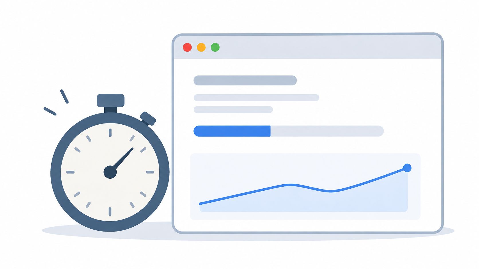
The incantation is uncomfortable, because you are hurting the page on purpose. Extra wait will cut conversion. The potion is an artificial delay served only to a test group, with everyone else on the normal page. The omen is purchases, or checkout completion, not a lab score from a laptop on office wifi. You are measuring the cost of slowness so you can justify the cost of fixing it.
Prove the speed spell on your checkout
Pair the fix with a conversion test. A faster page is a hypothesis until revenue or leads move. Read Core Web Vitals around the change. Check LCP before and after so you know the page got quicker, not just busier in the profiler. Do not borrow someone else's percent. A famous latency story is a reason to test, not a number you can paste into your forecast.
Say your product page is heavy with video. Ship a lighter version to half of mobile visitors, same copy, same price. If conversion does not move, the speed work may still be worth it for comfort, but you have not earned a revenue claim.
Public record: performance-as-a-variable is the idea these talks made famous. The specific "each tenth of a second equals about one percent of sales" line is a commonly cited figure, not a result documented in the sources behind this article. Treat it as folklore until your own delay test agrees.
How the Eight Famous A/B Tests Compare at a Glance
Each row opens a small spellbook entry: the hypothesis is the incantation, the tested alternatives are the potions, and the primary metric is the omen to watch. The outcomes below distinguish reported findings from the narrower lessons the public record supports.
| Item | Element Tested | Primary Metric | Reported Outcome | Best For |
|---|---|---|---|---|
| Google's 41 Shades of Blue: The Enchanted Hue Duel | 41 link and ad text shades of blue | Click-through rate | Higher click-through on the winning shade | Validating small visual changes with high traffic |
| Obama 2008 Campaign Splash Page Sorcery | Page media and call-to-action button combinations | Email sign-ups | Higher email sign-up rate from the winning media-and-button pairing | Optimizing landing pages for conversions |
| Bing's Ad Headline Experiment: The Revenue Charm | Ad headline formatting | Revenue per search | Double-digit percentage revenue increase | Testing monetization changes in search |
| Booking.com's Thousands of Concurrent Experiments | Search, pricing displays, and booking flows | Booking progression | Thousands of tests reportedly run concurrently | Scaling experimentation across teams and product areas |
| Netflix's Artwork Personalization: The Thumbnail Enchantment | Personalized title artwork and thumbnails | Plays and engagement | Artwork choice meaningfully influences whether viewers start watching | Testing creative assets and audience personalization |
| Wikimedia's Donation Banner Testing: The Scroll of Generosity | Banner messaging, imagery, suggested amounts, and calls to action | Donation rate and average gift | Many experiments and results are published openly | Improving fundraising with transparent testing |
| Etsy's Feature Flags and Search Experiments: The Marketplace Spell | Search ranking, listing presentation, and seller tools | Buyer and seller outcomes | Supports gradual rollouts and testing across marketplace experiences | Testing changes in two-sided marketplaces |
| Amazon's Latency Experiments: Every 100ms Matters | Page load latency | Revenue | Added load time is linked to lower sales; the per-100 ms figure is a widely repeated estimate | Quantifying performance impact on revenue |
To reuse the recipe, name one element to change, choose the metric that matches the intended outcome, then compare the alternatives. A click-through omen suits a link-color duel; booking progression fits experiments in the reservation flow. Public reports can support the direction of a finding without making every famous result a forecast for another site.
Your Spellbook for Running Tests That Actually Win
Say a café owner sees visitors reach the menu but leave before ordering. The first spell is a precise hypothesis: a clearer delivery offer will increase completed orders. Change one element, choose one primary metric, and set a guardrail so a lift in orders does not conceal a worse customer experience. Start with a page that already receives traffic, write down the prediction, then let the evidence decide.
A useful yardstick, not a target, is the 2024 median landing-page conversion rate across industries: 6.6%, according to the Unbounce Conversion Benchmark Report, as reported by Convertica. A small shop should not copy a result from Netflix and expect the same outcome. On a quiet page, even a large relative lift may mean only a few additional conversions, while uncertainty remains wide.
For a low-traffic page, patience matters. Practitioner guidance on A/B testing warns that repeatedly checking results until a p-value falls below 0.05 increases the chance of a false winner. A sequential test needs stopping rules chosen before launch. Relative lift and absolute improvement are different, as are statistical significance and practical value. Keep a test running through a full business cycle when appropriate, or roll out a low-risk change while acknowledging that the result remains uncertain.
Now check the cauldron itself. If a planned 50/50 split produces badly uneven buckets, that imbalance is not evidence that one variant won. Microsoft Research's guidance on sample ratio mismatch describes possible failures in assignment, execution, log processing, and analysis. Bucketing bugs, identity mixups, redirects, mid-test edits, bad joins, and biased reads can distort the result. Pause promotion if allocation integrity fails. Check the instrumentation before celebrating.
For teams that want help running the experiment, Web Mage's Conversion Alchemist creates and runs a split test automatically. A draft is a challenger page with a new headline, layout, or offer. Creating and monitoring one split test costs about 5 credits. The Conversion Alchemist promotes a winning variant when significance is reached and retires the losing one, so you still need to check the split and sample size yourself before trusting a result. Before choosing a page to enchant, build a targeted keyword strategy to focus on a page people can find.
Web Mage generates a live website or funnel from a plain-English description, including pages, copy, images, and layout. Its Conversion Alchemist can draft and run challenger variants, then promote the winner and retire the loser. Put one suitable page through a split test, and judge the result by the metric and guardrail you chose in advance.