
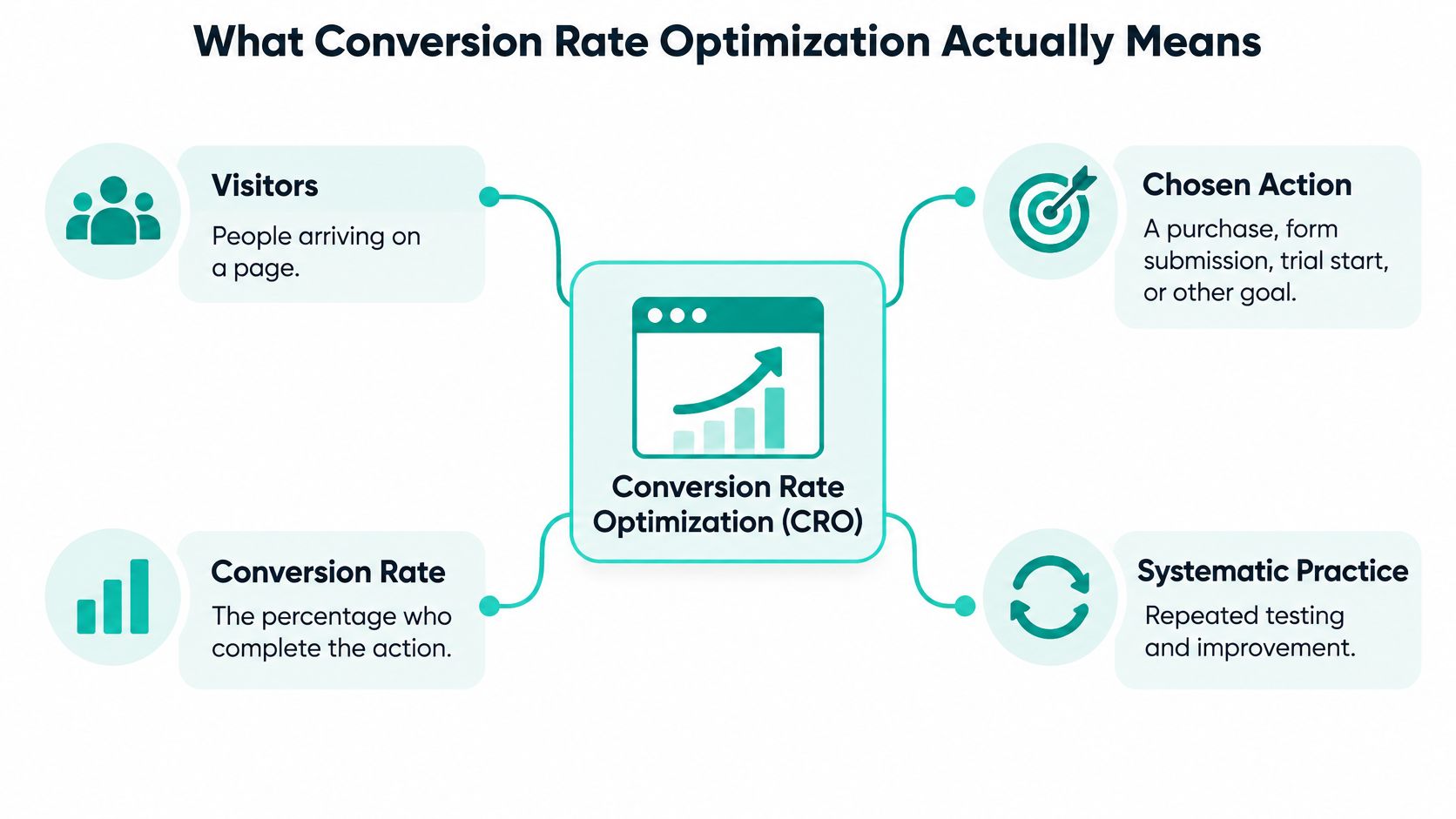
Conversion rate optimization is the systematic practice of raising the share of website visitors who complete a chosen action, with conversion rate calculated as completed actions divided by visitors times 100.
The useful magic isn't persuading everyone to click. It's helping interested people finish what they came to do, then proving that the change improved the business without making the experience less fair. A busier checkout isn't a victory if customers spend less, request more refunds, or feel tricked.
Table of Contents
- What Conversion Rate Optimization Actually Means
- The Metrics That Tell You the Spell Worked
- Common CRO Methods and the Tools That Run Them
- How a Controlled Conversion Test Works
- Why Carts Vanish and Which Fix to Try
- Form Fields You Can Banish From Checkout
- When a Winning Test Becomes a Curse
- Run One Guarded Test This Month
What Conversion Rate Optimization Actually Means
A mage with a cracked cauldron doesn't solve the problem by pouring faster. More ingredients just spill onto the workshop floor. Websites can have the same problem: you attract visitors, but confusing prices, awkward forms, or unanswered questions prevent them from completing an action.
Conversion rate optimization, or CRO, means finding those cracks and testing repairs. The chosen action might be a purchase, a submitted enquiry, a trial signup, or a booked consultation. You need to name that action precisely before you can improve it.
The scale of the opportunity is striking: Baymard Institute's cart-abandonment database reports an average documented abandonment rate of 70.22% across 50 studies, and estimates that large e-commerce sites could achieve an average 35.26% conversion-rate increase through better checkout design.
Those findings describe checkout research, not a promised result for your shop. They do, however, challenge the assumption that businesses always need more traffic before they can grow.
Choose the action before casting the spell
Say a candle shop wants more completed orders. Its owner shouldn't count newsletter subscriptions as equivalent successes just because they're easier to obtain. A subscription can support a purchase journey, but it doesn't answer whether checkout improved.
Likewise, a consultant needs more than submitted forms. If a shorter form attracts enquiries from people who can't use the service, the apparent improvement may create extra work rather than valuable demand.
Keep these distinctions clear:
- The business goal is the valuable outcome, such as a fulfilled order or qualified sales conversation.
- The conversion event is the observable action you're measuring.
- The experiment tests whether a particular change improves that event without undermining the goal.
CRO isn't a weekend redesign decorated with a spreadsheet. It's repeated diagnosis, intervention, and verification. A clearer explanation, better error message, or easier payment flow can be more useful than an elaborate visual makeover.
Workshop rule: Improve the visitor's ability to complete a worthwhile action, not your ability to declare a win.
The Metrics That Tell You the Spell Worked
Conversion metrics and the guardrail for each
| Metric | How to calculate | How to read it | Guardrail |
|---|---|---|---|
| Conversion rate | Completed actions divided by visitors times 100 | Compare with your own baseline for the same action | Revenue per visitor or lead quality |
| Cart abandonment | One minus orders divided by carts started | About 70 percent of carts is a common warning, not a target, as documented in Baymard's checkout-usability research | Whether the drop is cost shock or form friction |
| Checkout completion | Orders divided by checkout starts | Isolates the payment path from browsers | Refund rate and support contacts |
| Micro-conversion | Step completions divided by visitors to that step | Shows which earlier step leaks | Don't celebrate a click if the final action falls |
| Revenue per visitor | Revenue divided by sessions | Catches more orders that are worth less | Average order value and refunds |
Multiply the ratio-based measures by a hundred when you want to display them as percentages. Revenue per visitor is a monetary measure, not a percentage.
Keep the denominator consistent
A visitor and a session aren't interchangeable. Someone can return for another session, so decide which denominator your reporting uses and keep it consistent across the baseline and both test variants.
The table uses the common session-based calculation for revenue per visitor. Label that choice clearly in your dashboard rather than comparing it with a user-based figure from another report.
Also decide what counts as completion. For a visitor-based purchase rate, count visitors who purchased rather than letting repeat orders inflate a measure intended to describe the proportion of people who bought.
Read the rows for your business
For an online shop, checkout completion helps separate payment-path trouble from general browsing. Revenue per visitor then checks whether an easier path produced valuable orders rather than merely encouraging smaller baskets.
For a lead-generation site, form completion is the starting signal. Track whether those enquiries meet your qualification criteria and become useful conversations. Removing a budget question might increase submissions while sending unsuitable prospects to your sales team.
For a trial-based product, signup is an entry event. Activation, meaning a user reaches a defined moment of product value, helps you assess whether the new signup flow attracted people who can benefit.
Instrument the journey at meaningful boundaries:
- Cart view and checkout start distinguish consideration from entering the buying process.
- Shipping and payment submission reveal where practical requirements become obstacles.
- Order confirmation records completion, ideally reconciled against confirmed orders.
Rank possible repairs by affected traffic, drop-off severity, implementation effort, and expected incremental revenue. A dramatic percentage change on a rarely visited page may matter less than a modest improvement in a heavily used checkout.
Guardrails are vetoes, not decorative dashboard widgets. A higher click rate doesn't qualify as success when the business outcome deteriorates.
Common CRO Methods and the Tools That Run Them
- Diagnose the stall. Use funnel analytics to locate exits, then inspect relevant session recordings for clues such as repeated errors or unsuccessful taps. Mask sensitive inputs and respect visitors' privacy choices.
- Watch people attempt the task. Ask representative users to buy, enquire, or start a trial without coaching them. Their hesitation can expose unclear instructions that your team no longer notices.
- Simplify forms and flows. Remove requests that aren't necessary at that moment. Keep useful guidance and validation, because a shorter form isn't automatically an easier form.
- Answer objections earlier. Make delivery costs, return terms, service scope, and payment information easy to find before someone commits.
- Validate a focused change. Test a coherent intervention rather than mixing unrelated edits into a mystery potion.
Match the tool to the job
Web analytics, such as Google Analytics 4, counts events and shows funnel movement. Check that confirmation events don't fire again when someone refreshes a page.
Session-recording and usability tools help investigate behavior. A recording can show that someone struggled with an address field, but it can't establish their private motivation. Combine observation with direct feedback.
A/B testing platforms handle assignment, variant delivery, and outcome comparison. When reviewing A/B testing tools, check whether they support your conversion event, consistent visitor assignment, and the statistical method you intend to use.
Internal builds can work when developers can maintain assignment logs, exposure records, and outcome joins. They're less suitable when nobody owns tracking quality or deployment safety.
Don't buy a tower full of enchanted instruments before you know the problem. Start with reliable event collection, a way to investigate friction, and a controlled testing setup. Extra features won't rescue an experiment that measures the wrong action.
How a Controlled Conversion Test Works
An A/B test compares an original experience with a challenger while assigning eligible visitors to variants. Running both versions concurrently helps distinguish the change's effect from changes in demand or visitor mix.
Tools change, but that principle survives: The A/B Testing Database's Google Optimize profile records that Google Optimize ceased operation on September 30, 2023. A durable testing process shouldn't depend on a particular familiar remaining in service forever.
Follow a predeclared testing ritual
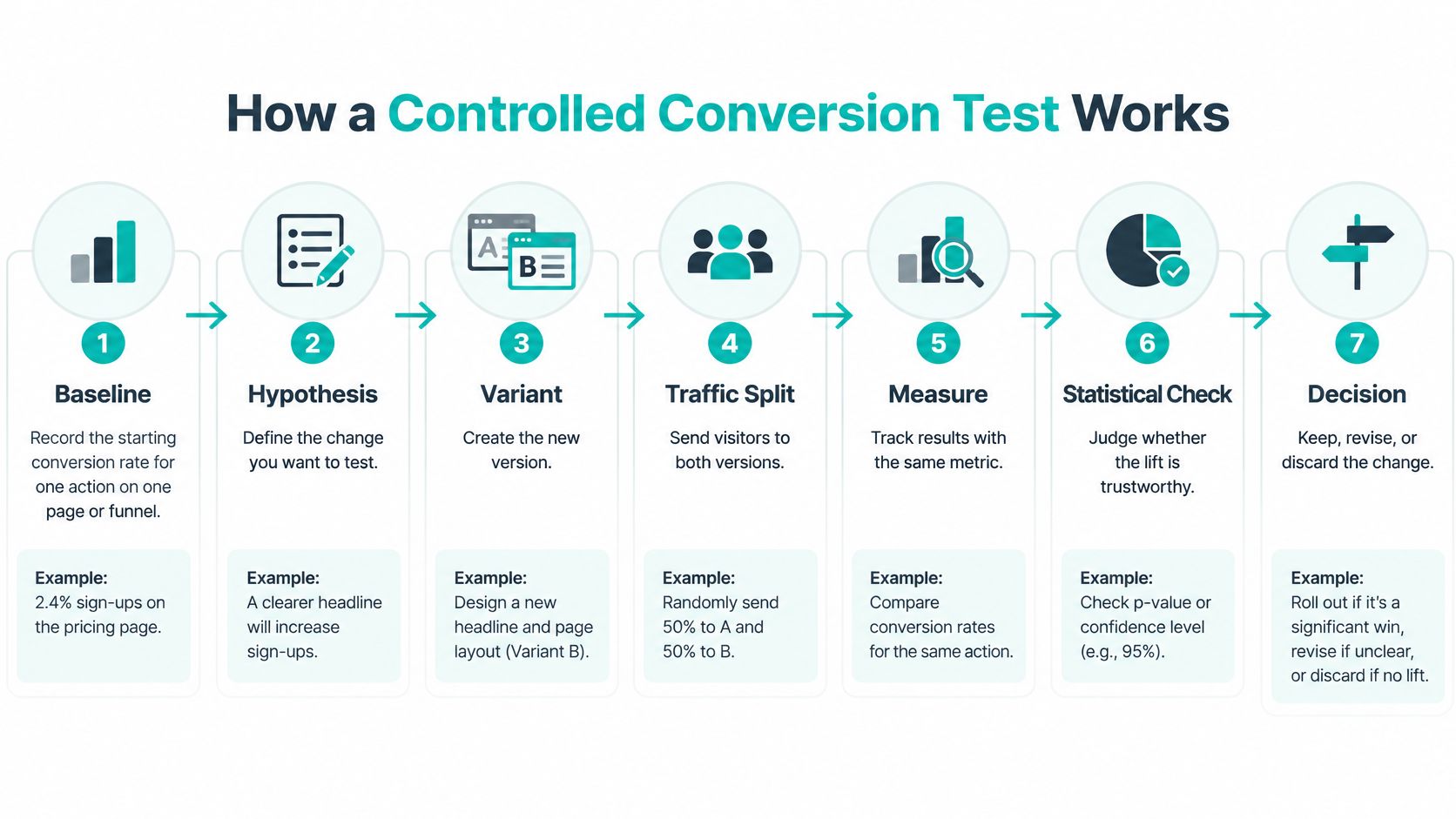
Record the baseline. Measure the chosen action on the page or funnel you're changing, and verify that the event represents genuine completion. Without trustworthy tracking, you can't judge improvement.
Locate the most consequential stall. Combine funnel exits with usability evidence, rather than selecting a page because someone dislikes its appearance. Prioritize a problem that affects meaningful business activity.
Write a testable hypothesis. Name the friction, the proposed treatment, and the primary metric. For example, making delivery charges visible on the cart page should improve completed purchases by reducing late surprises.
Set the rules before exposure. Define the eligible audience, random allocation, minimum detectable effect, sample requirement, stopping rule, and guardrail limits. Low-traffic sites should favor a consequential change on a well-used page rather than expecting to detect a tiny difference quickly.
Run the original against a focused challenger. Keep assignment consistent so returning visitors don't bounce unpredictably between versions. Additional variants require more traffic and appropriate handling of multiple comparisons.
Read the result and its consequences. Assess the primary metric using the planned method, then examine revenue, refunds, lead quality, or another relevant guardrail. Allow downstream outcomes enough time to mature.
Make and record the decision. Promote the challenger only when it meets the statistical and operational criteria. Otherwise, retain the original and document whether the result was negative, inconclusive, or invalidated by a tracking problem.
Separate monitoring from deciding
Check operational health while the experiment runs. Broken pages, failed payments, or missing events require attention immediately.
That's different from repeatedly checking an ordinary fixed-sample significance result and stopping whenever it looks favorable. Use the stopping procedure your statistical method supports, not whichever dashboard snapshot flatters the challenger.
A practical guide to running A/B tests can help translate the protocol into implementation. The essential habit is deciding how you'll judge the spell before seeing whether it sparkles.
Why Carts Vanish and Which Fix to Try
Unexpected costs need a pricing treatment, not a prettier payment button. Someone surprised by shipping charges has a different problem from someone who can't use their preferred wallet.
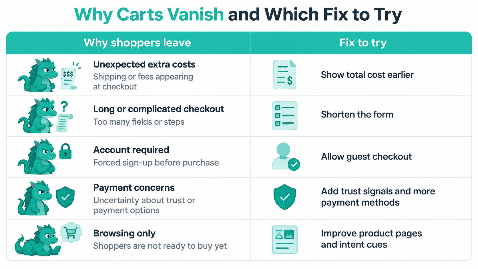
The figures below combine distinct findings: Baymard's checkout-flow analysis reports 39% for unexpected costs, 19% for forced accounts, 18% for complexity, and 10% for an unavailable preferred payment method; Shopify's account of Baymard's U.S. shopper research reports 40% for extra costs after excluding browsing-only shoppers and 17% for a long or complicated checkout.
Checkout abandonment causes and the test for each
| Why shoppers leave | Share | Hypothesis to test |
|---|---|---|
| Unexpected extra costs such as shipping, tax, or fees | About 39 to 40 percent | Show the full price before the last step |
| Forced account creation | About 19 percent | Offer guest checkout |
| Checkout too long or complex | About 17 to 18 percent | Remove steps and nonessential inputs |
| Preferred payment method unavailable | About 10 percent | Add the missing payment option |
Read the cost and complexity figures as ranges across those findings, not perfectly interchangeable measurements or forecasts for your customers. These are reasons shoppers report, not slices you should add into a single pie.
Give each dragon its own treatment
For cost shock, show available delivery estimates and explain when taxes or fees become calculable. If you need an address to determine the total, explain that requirement instead of implying the displayed subtotal is final.
For the account wall, offer a visible guest route. Move optional account creation to a less obstructive point, such as after purchase.
For complexity, remove unnecessary inputs, improve labels, and preserve entered information after errors. Merely combining screens won't help if shoppers still face the same confusing work.
For missing payment options, investigate what eligible customers need. Adding unrelated badges won't substitute for a payment method they can use.
Prioritize the affected journey
Use checkout-page optimization to investigate the actual obstacle before commissioning a rebuild. Estimate how many customers encounter it, how severely it blocks completion, what the repair costs, and what additional revenue could justify that work.
Inspect device, country, acquisition source, new versus returning visitors, and product type. A mobile address problem and a desktop account barrier need different repairs, even when they appear in the same blended report.
A subgroup result is a clue unless the experiment was designed to establish that subgroup effect.
Monitor novelty effects, too. Returning shoppers may initially react to unfamiliar layouts differently from newcomers. Release the treatment only when the predeclared requirements and downstream outcomes support it.
Form Fields You Can Banish From Checkout
A pixie-sized candle store sells lavender jars and unnecessarily ambitious checkout forms. Before customers can pay, it asks for a company name, another phone number, a password, password confirmation, and a newsletter preference.
The owner wants customer information for future campaigns. The customer wants a candle. Those priorities needn't become a duel at the payment gate.
There's a concrete usability benchmark to guide the audit: Baymard's cart-and-checkout collection reports an average of 23.48 form elements displayed by default, while an optimized flow can contain as few as 12 elements: seven form fields, two checkboxes, two drop-downs, and one radio-button interface.
Trim requirements, not useful assistance
In the candle-shop scenario, the owner removes the duplicate phone request and makes the company field conditional. Customers can buy as guests, without inventing credentials while their basket waits.
The revised checkout collects the email, recipient, address, and payment details needed for the order. Optional requests appear only when relevant, rather than confronting every buyer with every possible business use case.
That isn't a promise that every store should match the benchmark exactly. Delivery arrangements, product restrictions, and payment requirements can justify different inputs.
Each field asks someone to understand a label, decide what belongs there, enter information, and possibly resolve an error. A field that's easy for the business to add can still impose unnecessary work on the buyer.
Audit your own checkout
Open the checkout on a phone and complete this inventory:
- List every visible element. Include inputs, checkboxes, selectors, account prompts, and fields revealed by earlier choices.
- Mark fulfillment requirements. Identify what you need to deliver the order, process payment, or contact the customer about a problem.
- Star marketing-only requests. Separate useful campaign information from information required to complete the purchase.
- Challenge conditional fields. Reveal company details or alternative billing information only when the customer's choices require them.
- Test error recovery. Enter an invalid address or omit a required field, then check whether the message explains the correction and preserves other entries.
Keep autofill support, clear labels, and helpful examples. Don't achieve a smaller field count by hiding essential instructions.
The candle shop's test hypothesis can stay specific: removing optional company and duplicate contact inputs will improve order completion without increasing address corrections or support contacts. Treat that cluster as a coherent intervention, not proof that every removed field contributed equally.
When a Winning Test Becomes a Curse
More tests isn't the goal. More dependable decisions is. A warlock can generate a mountain of variants and still learn little if the objectives keep changing.
Forrester's analysis of always-on experience optimization describes the shift toward continuous optimization and emphasizes explicit objectives, constraints, transparency, and governance. Automation needs those boundaries rather than permission to chase whichever signal rises fastest.
Separate discovery from confirmation
An exploratory test can reveal a promising pattern. A confirmatory test asks a narrower question using a prechosen metric and enough evidence to detect an effect worth implementing.
Don't retroactively promote an interesting subgroup or secondary metric into the experiment's original objective. Record it as a new hypothesis.
Statistical significance and practical significance answer different questions. A detectable improvement may still be too small to justify engineering maintenance, brand inconsistency, or customer-support work.

Refuse unfair victories
Fake countdowns, concealed charges, forced consent, and inaccessible controls can change immediate behavior while making the experience worse. Directive's discussion of B2B CRO trends highlights consent-first and server-side measurement as considerations when privacy choices and browser restrictions complicate attribution.
Server-side collection isn't permission to bypass consent. Compare analytics with confirmed business records, and investigate discrepancies rather than assuming the most flattering report is correct.
Use a quality-adjusted scorecard:
- Business value includes completed actions and qualified revenue.
- Customer consequences include refunds, unsubscribes, and complaints.
- Fairness and usability include transparent consent choices and accessibility defects.
A solo founder can test keyboard navigation, read the page on a phone, disclose prices clearly, and remove fabricated urgency. For automated experimentation, set evidence thresholds, retain holdout groups where appropriate, monitor novelty, and require human approval for material pricing or compliance changes.
Automation can handle the stirring. You're still responsible for what's in the cauldron.
Run One Guarded Test This Month
Choose a money-related action you can verify, such as a completed purchase or a qualified enquiry. Record its current performance and check that your analytics agrees with the underlying order or lead records.
Find a consequential stall using funnel events, customer questions, and observed behavior. Investigate cost surprises or burdensome forms if the evidence points there, but don't assume those are every site's main problem.
Write a small experiment contract
Before changing the page, record:
- The intervention names the exact obstacle and the treatment intended to remove it.
- The decision rule states the required evidence, stopping procedure, and conditions that would invalidate the test.
- The safeguard identifies the business or customer outcome that mustn't deteriorate.
A month is a useful planning window, not a compulsory deadline for declaring a winner. If your eligible traffic can't support a reliable decision, keep collecting evidence or choose a more consequential hypothesis. Don't lower the bar to fit the calendar.
If building the testing setup is the obstacle, our Conversion Alchemist familiar creates, runs, and promotes A/B split tests automatically, with creation and monitoring costing about 5 credits per split test. Our $8 monthly plan includes 500 credits every month, unlimited pages and funnels, speed, broken-link and keyword patrols, monthly SEO review, weekly analytics reading, hosting, SSL, and a custom sub-domain.
Automatic promotion doesn't remove your responsibility to choose a worthwhile goal and assess customer consequences. Keep the project deliberately small: repair the leak you can identify, measure the result, and retain the change only when the business outcome agrees.
Web Mage builds websites and funnels from plain-English descriptions and includes a Conversion Alchemist familiar for automated split testing. Visit Web Mage to build your site or prepare a focused challenger for a measurable conversion problem, with your success criteria and guardrails decided before the magic starts.